Tum Designs
Cape Cod, MA
OnCape Magazine Layouts
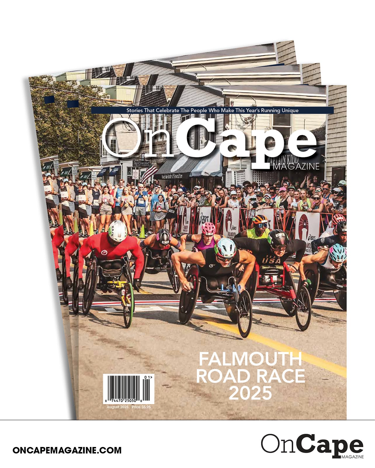
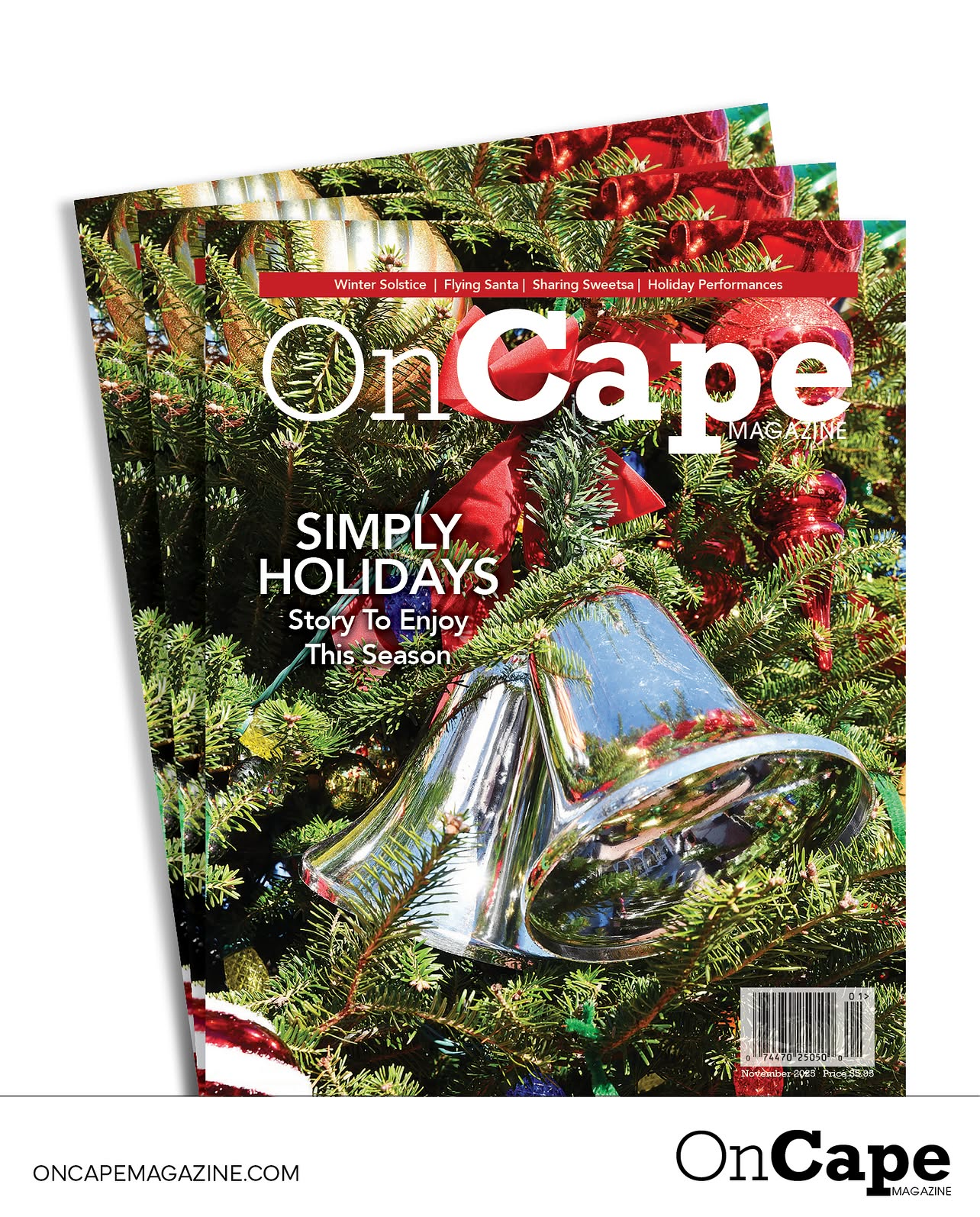
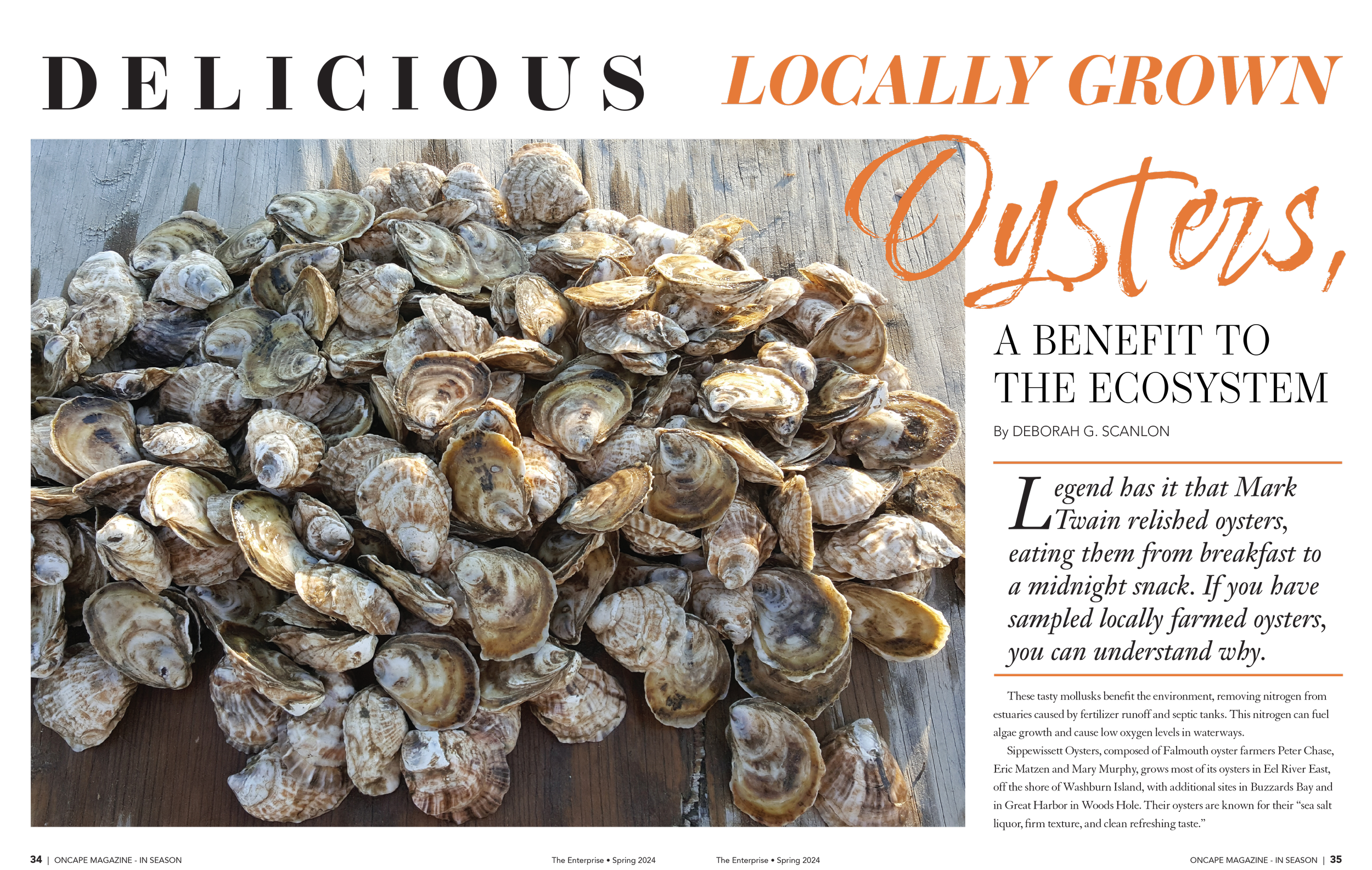
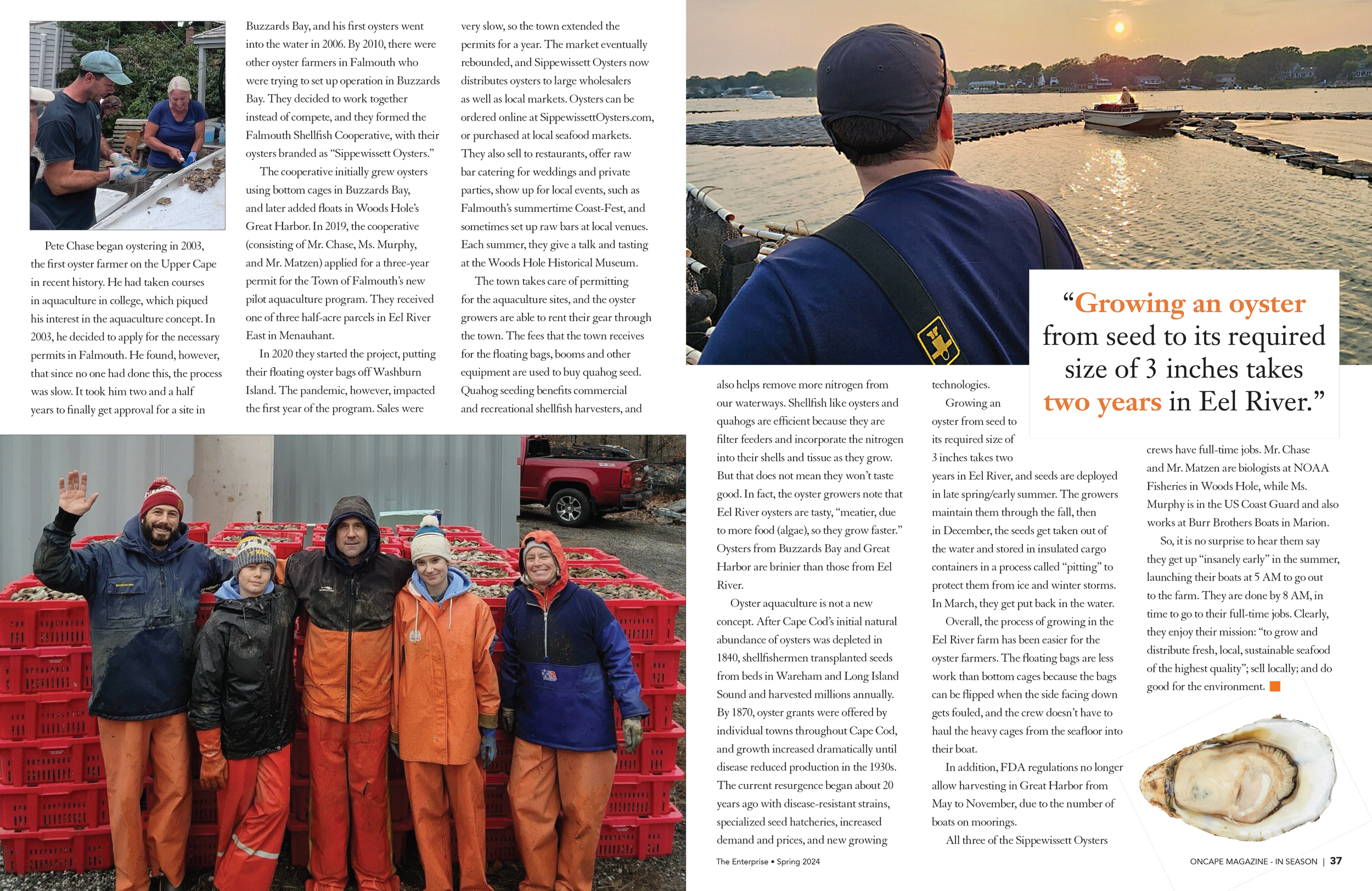
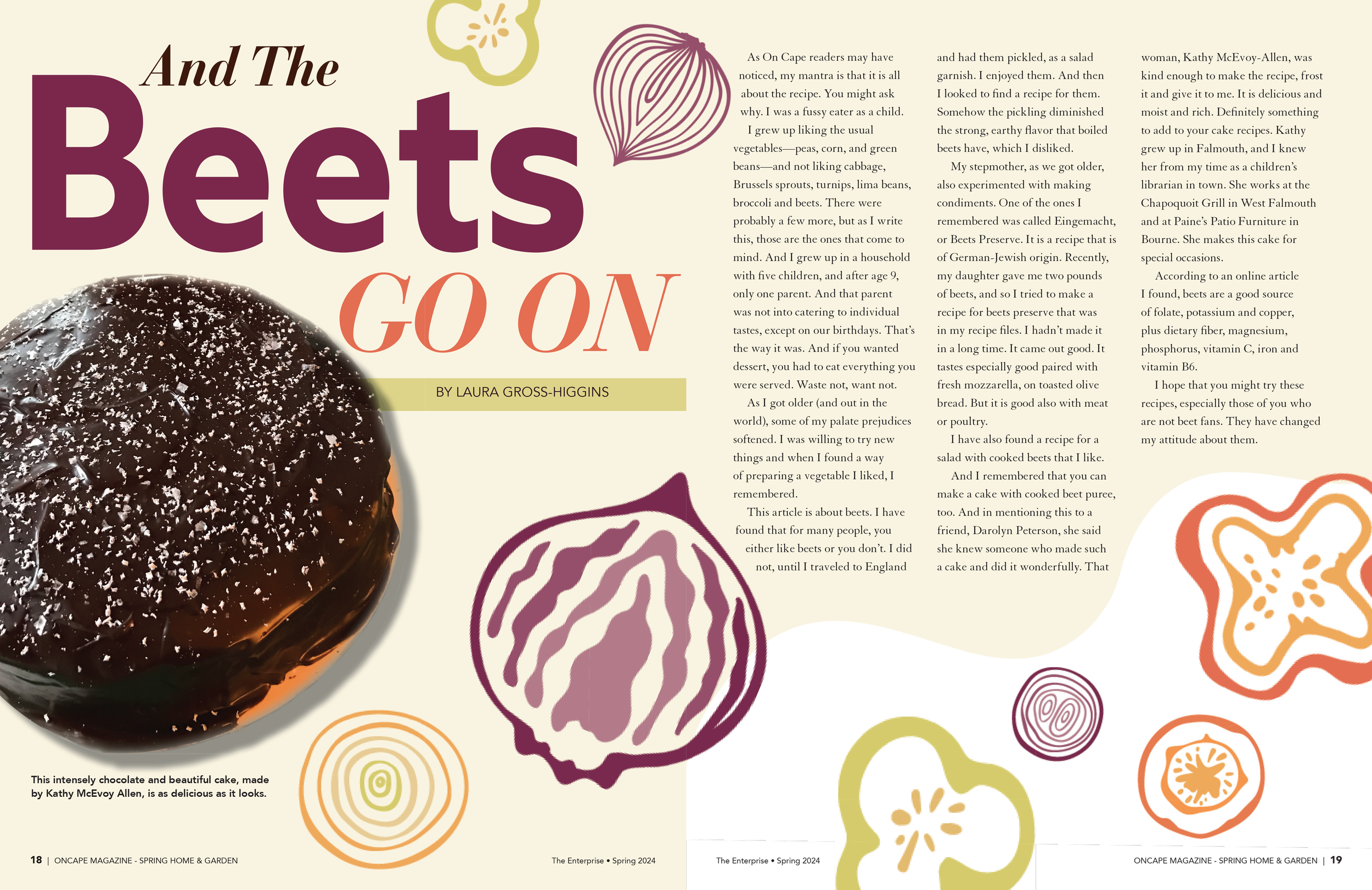
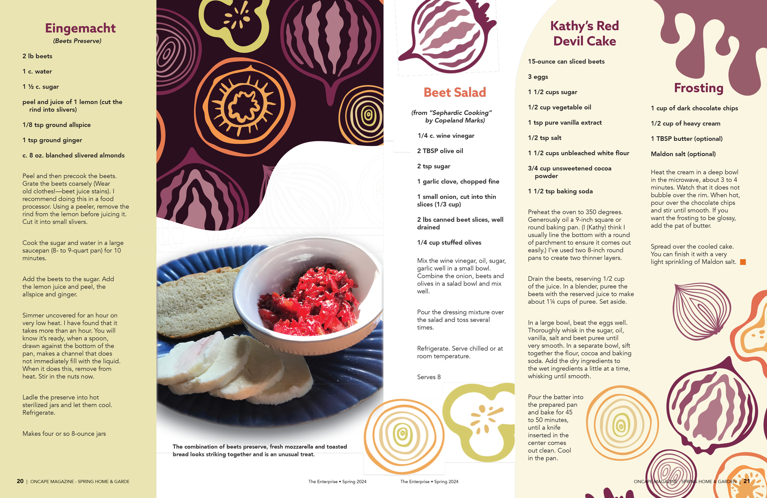
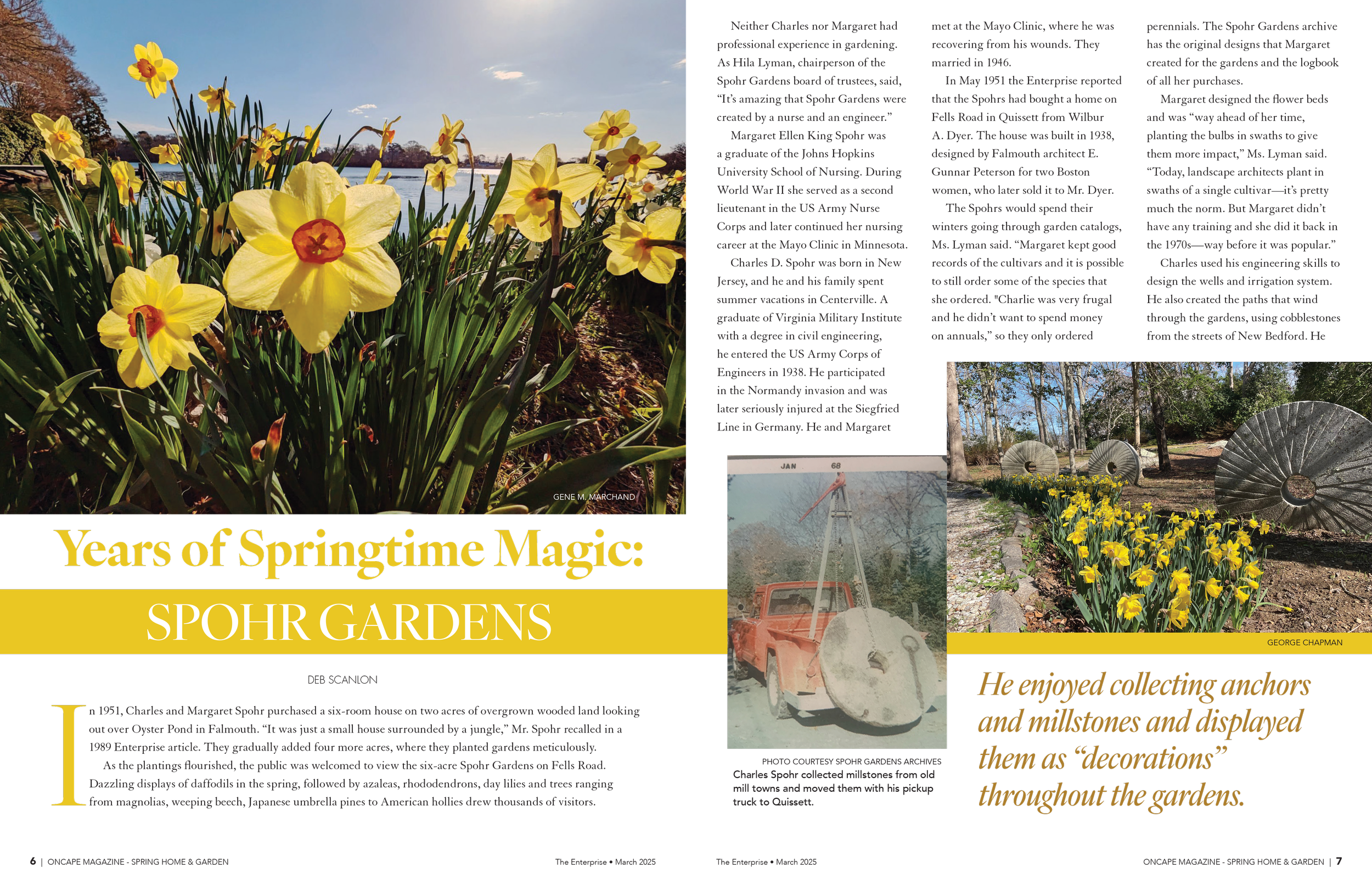
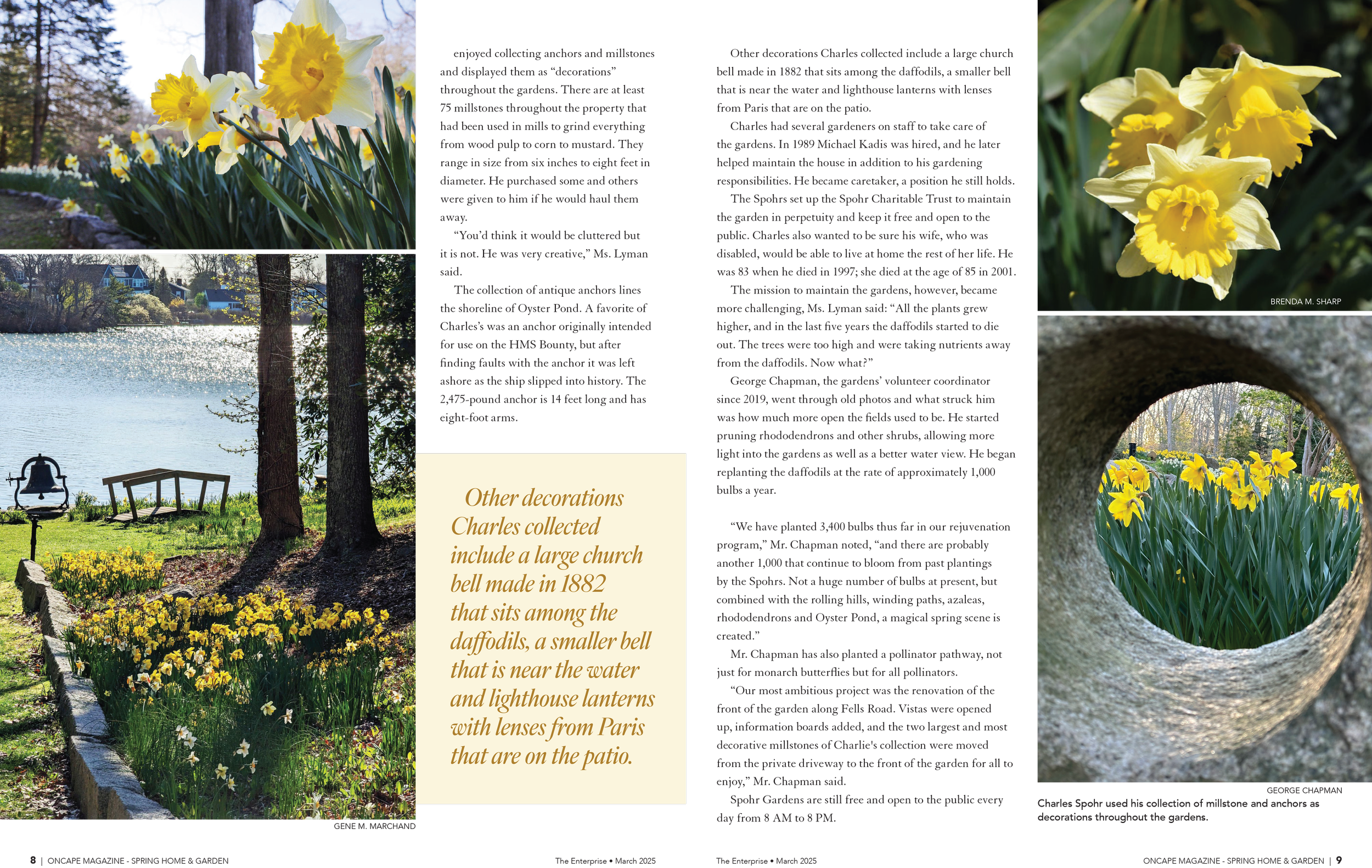
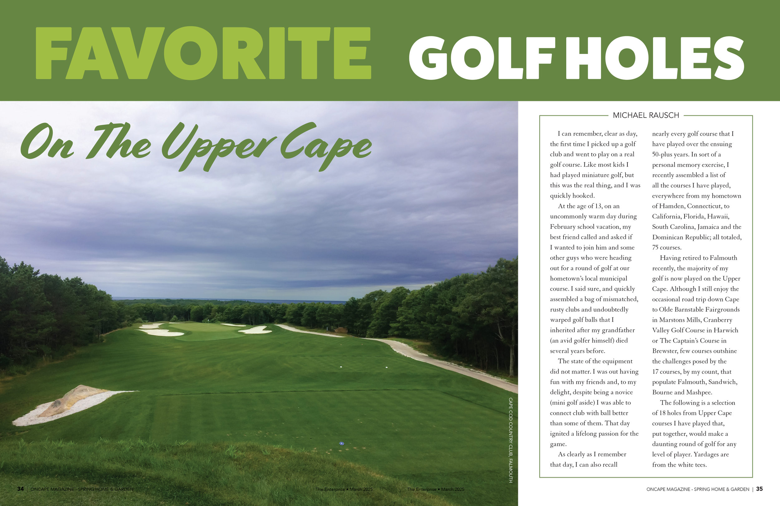
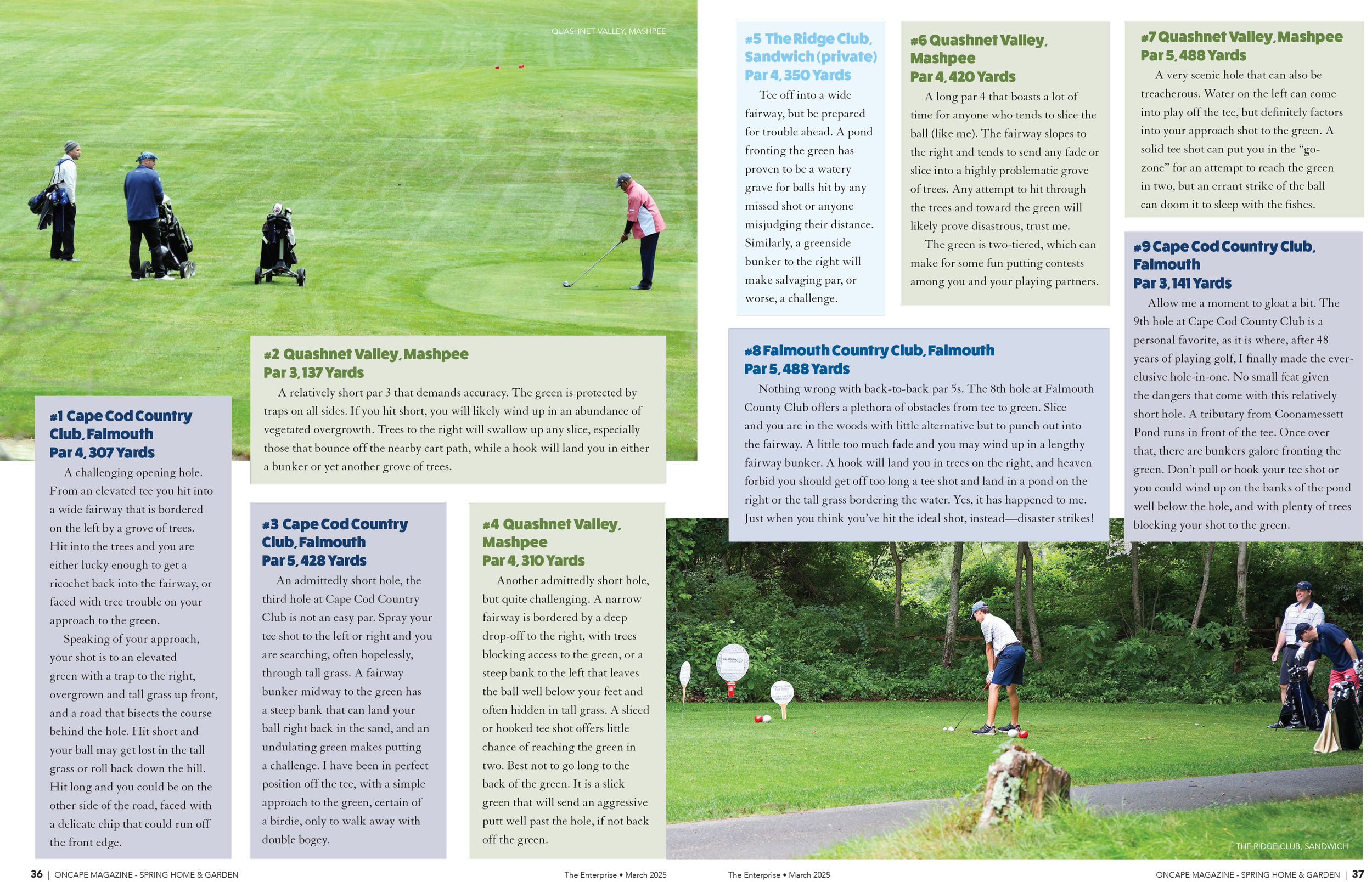
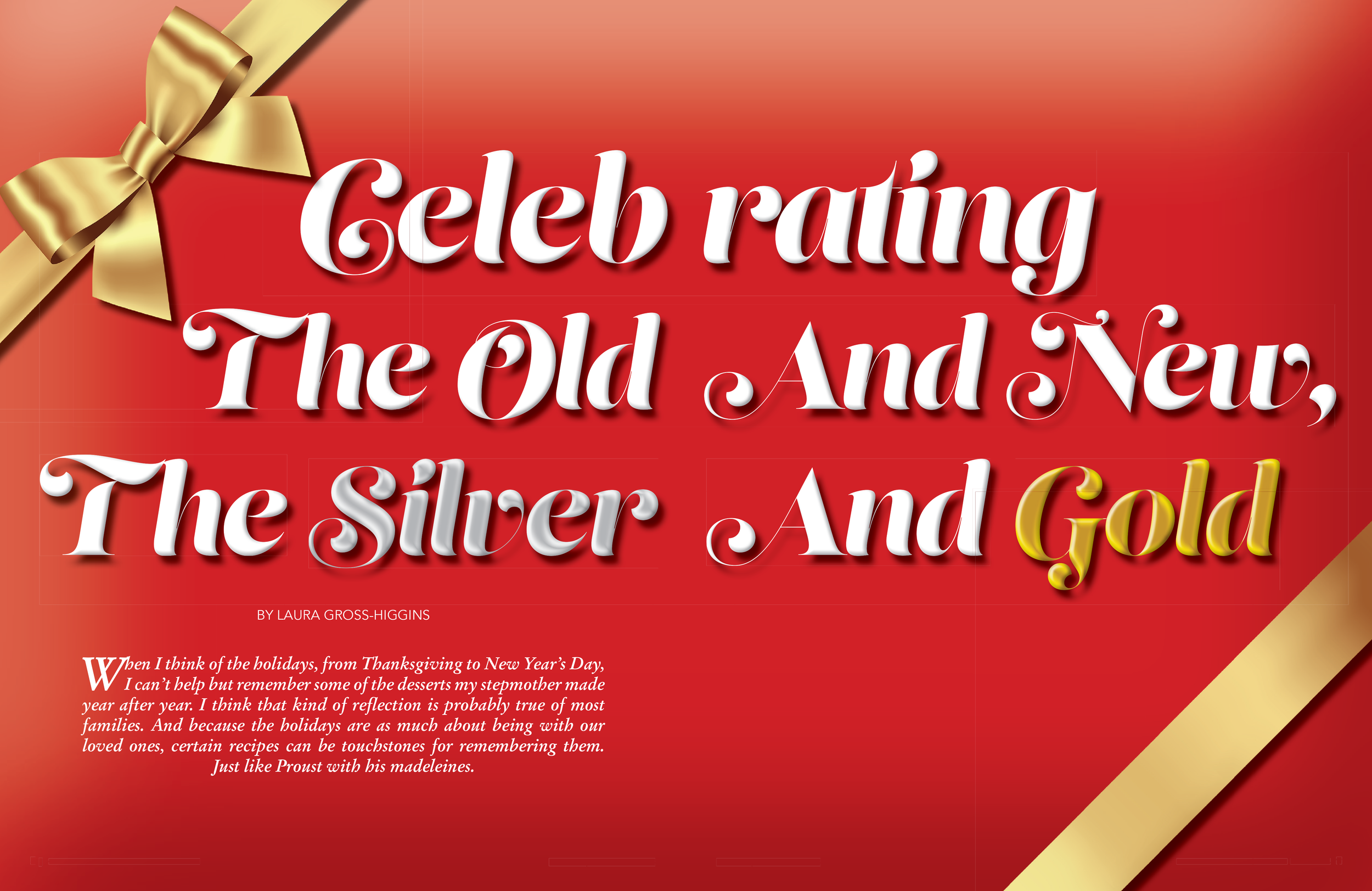
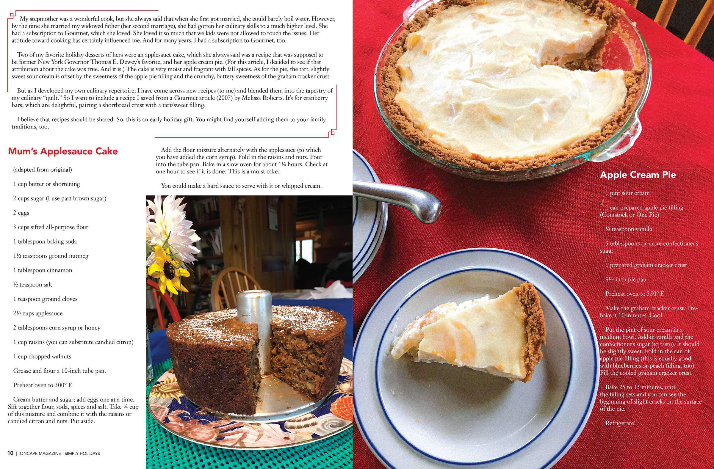
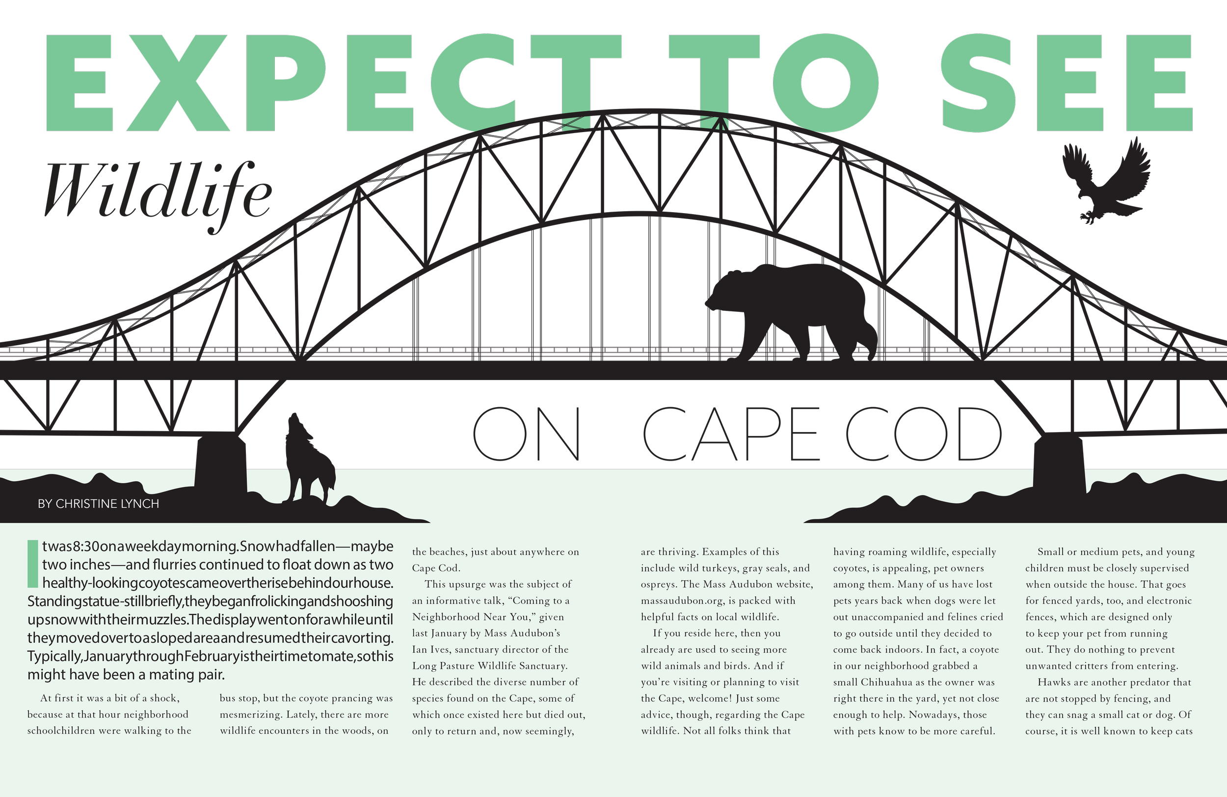
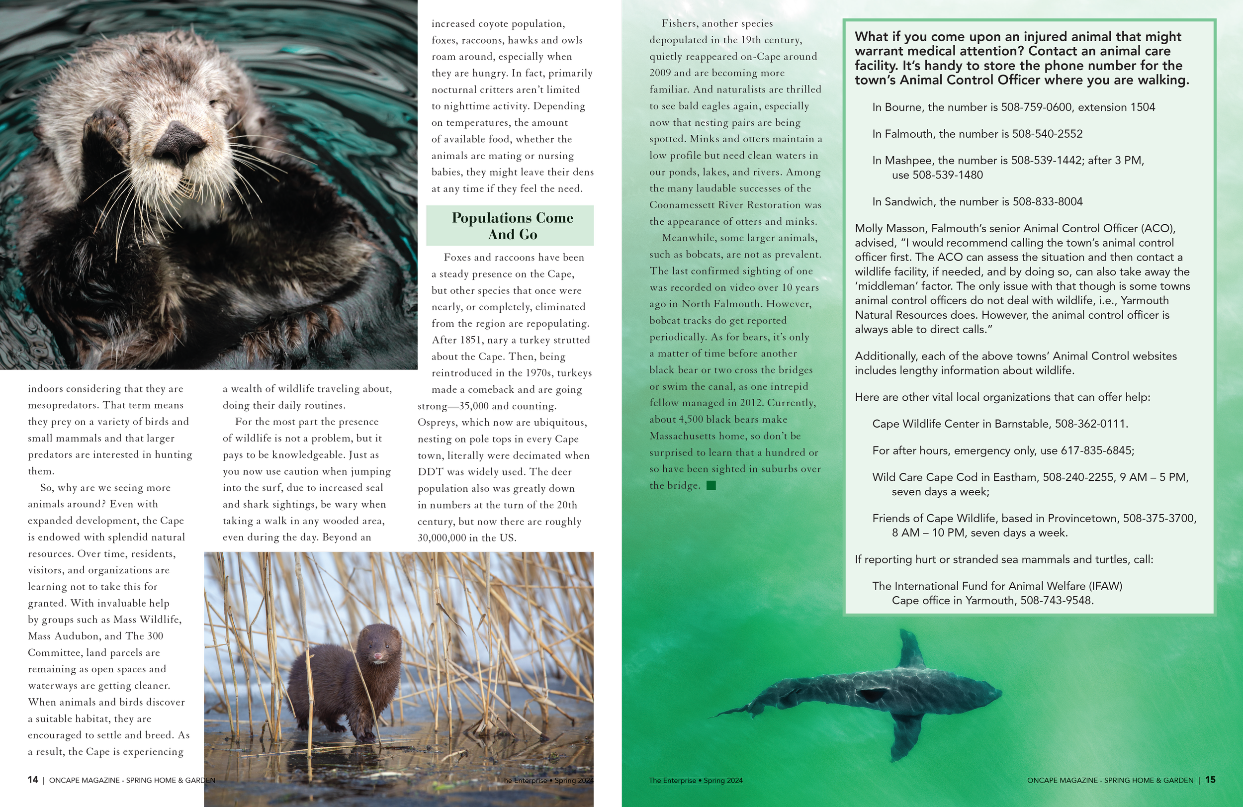
Working for a small, local newspaper company meant working with limited budgets for photography and creative resources. While this presented its challenges, it pushed me to become a more resourceful and creative designer. With limited access to high-quality photography, I learned to rely on strong typography, carefully selected stock imagery, and thoughtful layouts to create engaging, polished magazine spreads.
Working under tight deadlines with limited resources challenged me to find creative solutions without compromising readability or visual appeal. Rather than viewing these limitations as obstacles, I used them as opportunities to strengthen my design skills and make the most of what was available. This experience taught me how to work efficiently, adapt to constraints, and deliver compelling editorial designs that balanced creativity with the practical needs of the publication.
Haiken



Media Kit
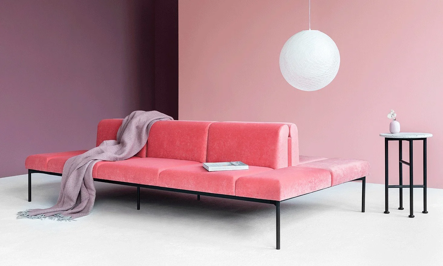
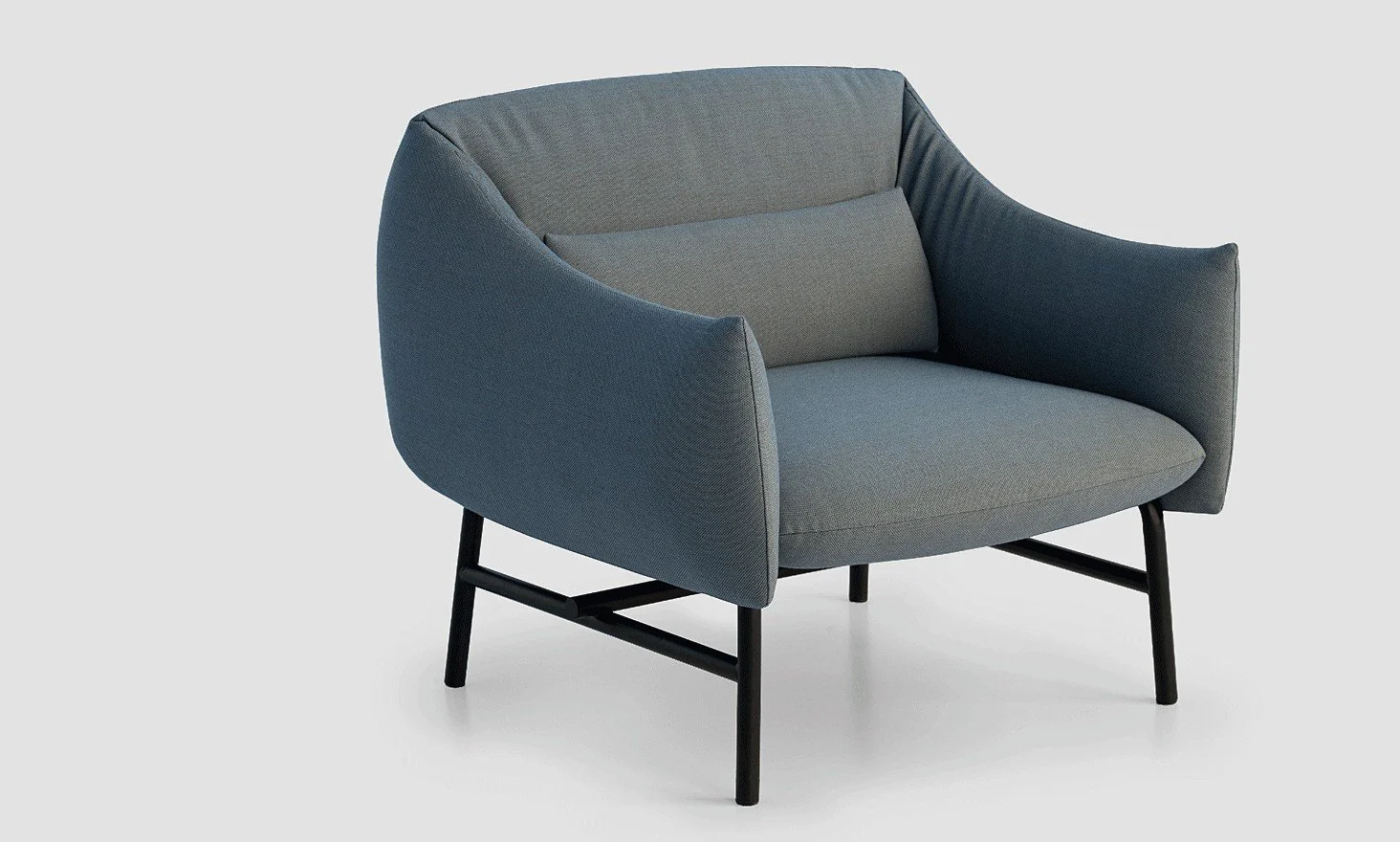
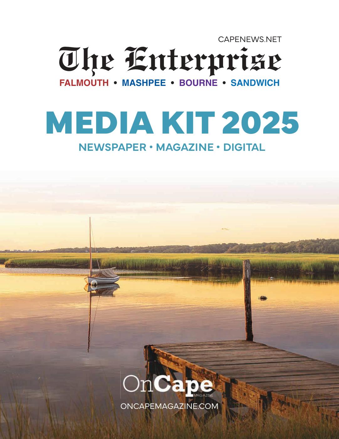
You can’t sell what no one understands. Clear, compelling design turns confusion into conversion. The Enterprise offers a variety of print and digital ad options that can be confusing to understand in a single meeting or email. I designed this media kit while collaborating with the sales team to get all of the information in one place so that clients could easily understand what we offered and could make better decisions for their own marketing goals.

Best Dish Contest
I brought Cape Cod to life on social media by managing all OnCape accounts for a lifestyle magazine that celebrates the community’s best. I created all graphics and oversaw the posting schedule, ensuring content was visually engaging and on-brand. I collaborate with local businesses to feature their products, events, and stories, helping them connect with the community. I also coordinated social media contests to drive engagement. Through strategic content planning and creative design, I showcase Cape Cod’s vibrant culture while maintaining a cohesive and professional aesthetic for the OnCape.
OnCape Social Media
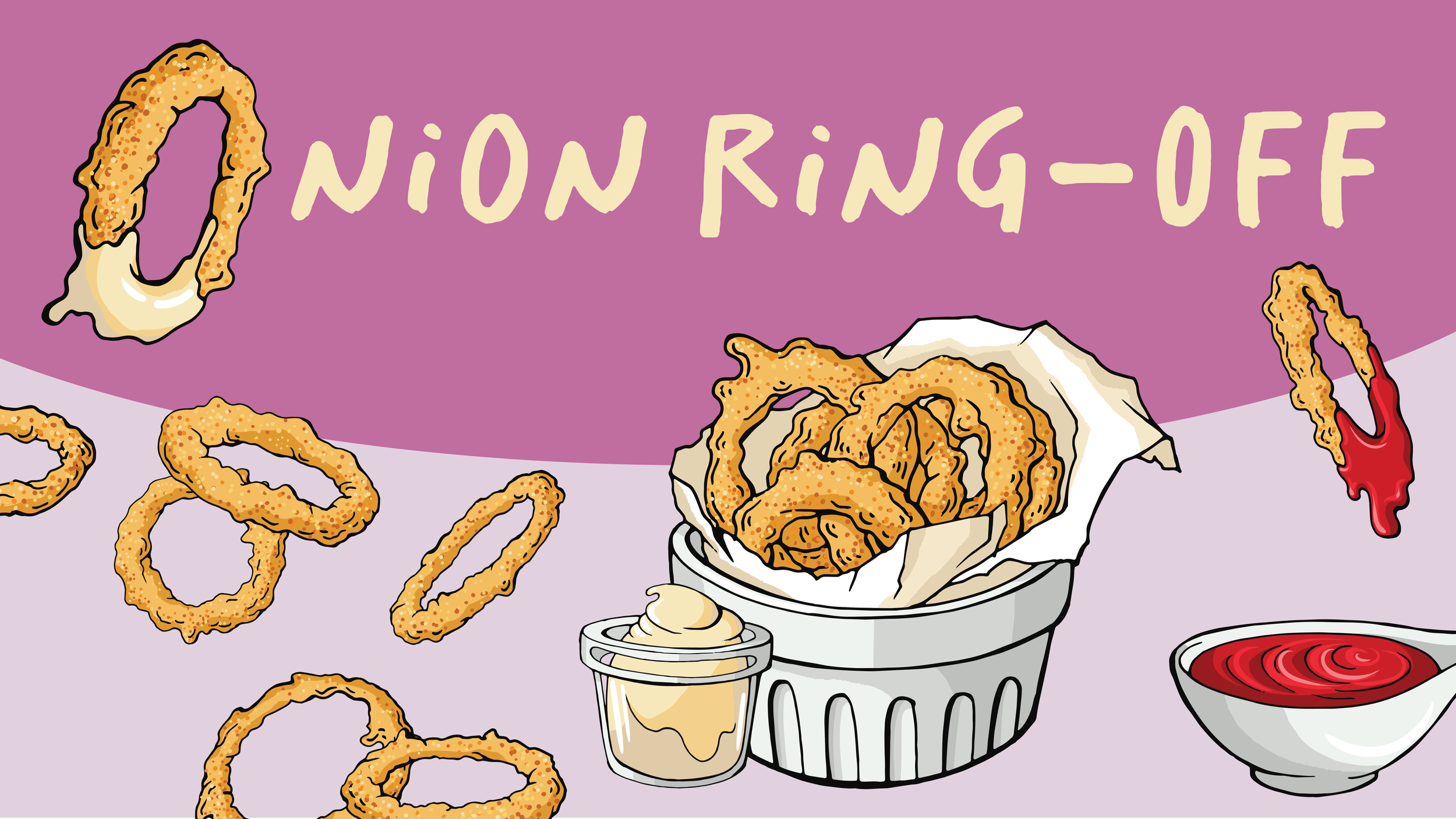
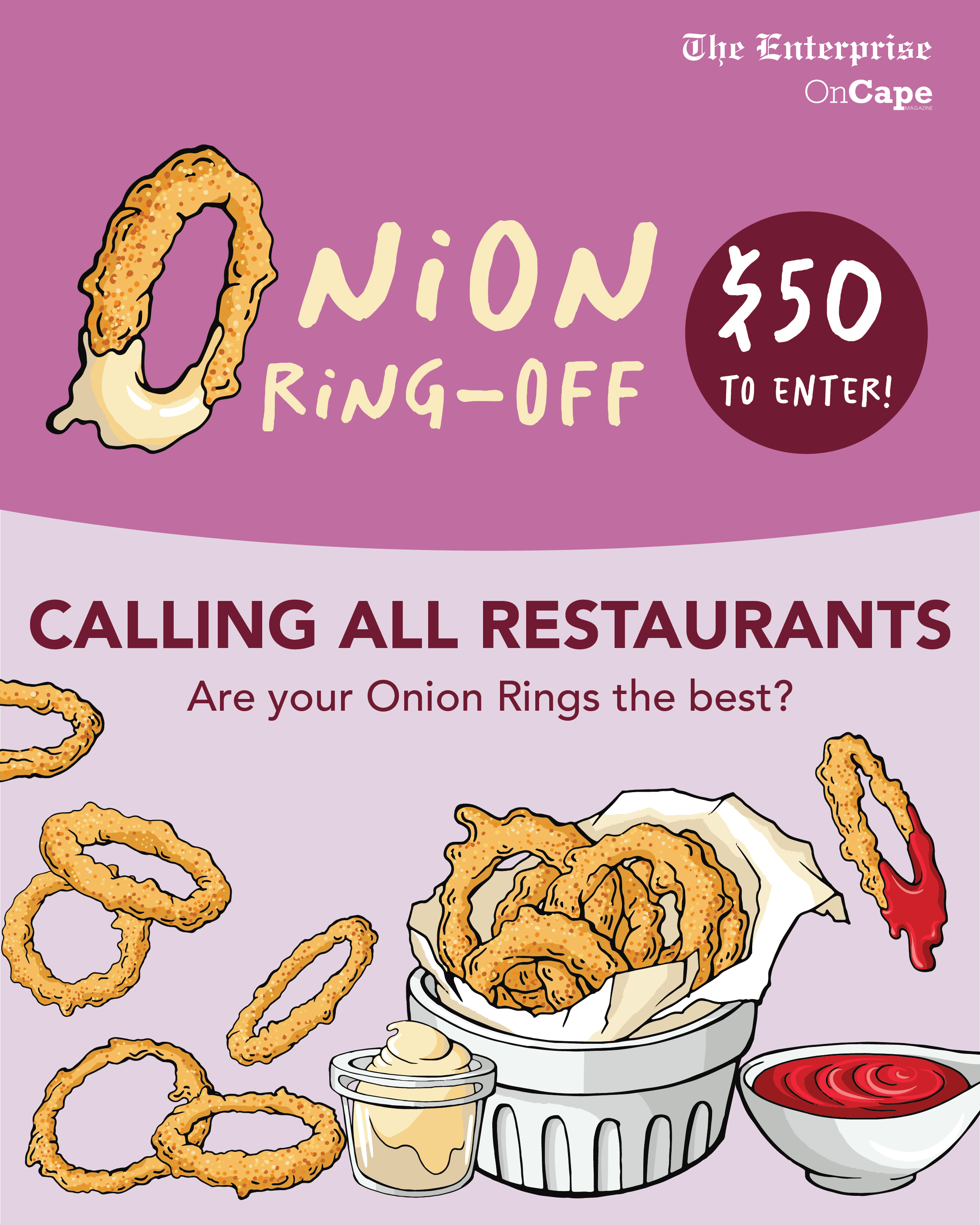
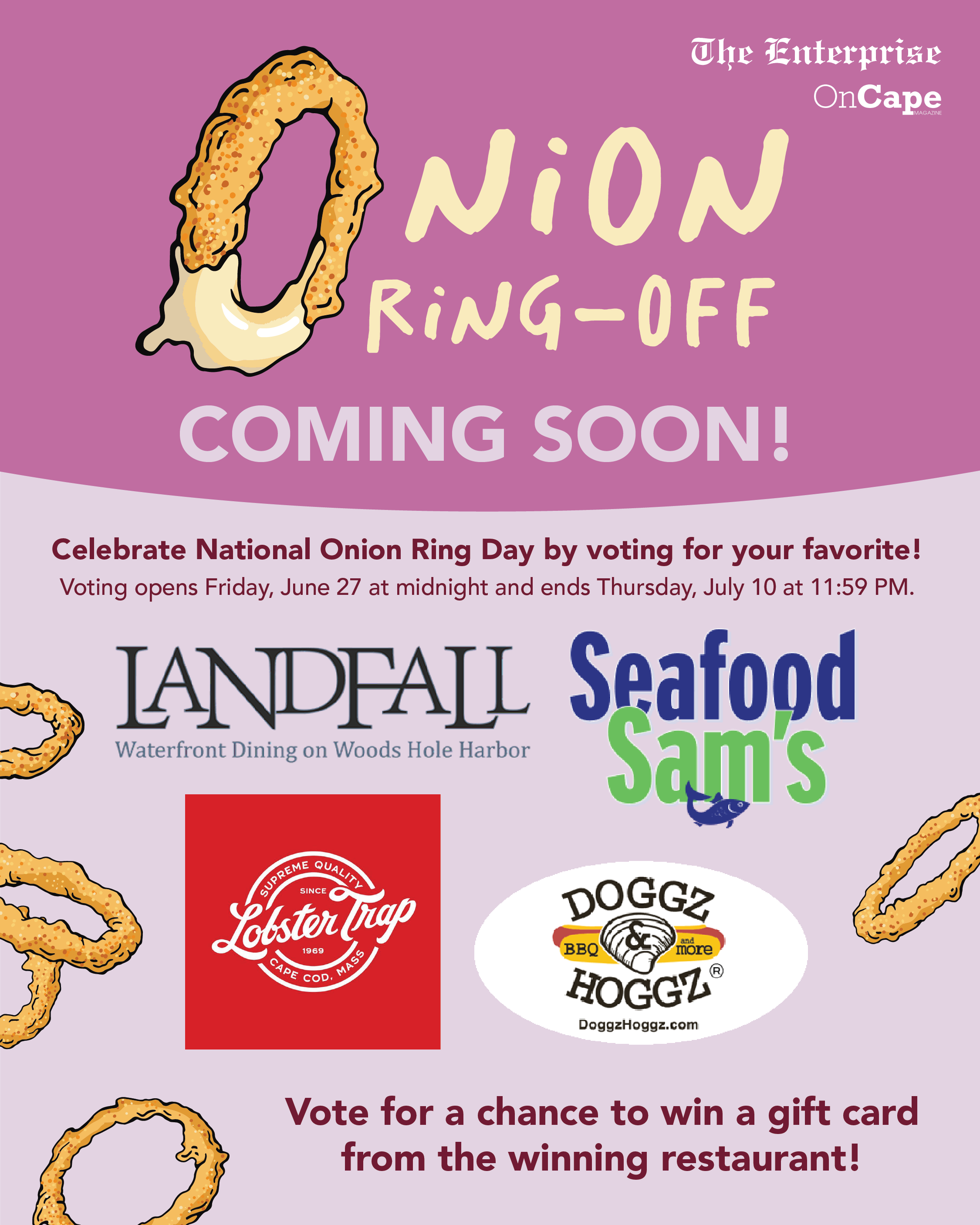
The Onion Ring-Off was one of my favorite competition campaigns to design. Working with local businesses and the Cape Cod community, the campaign invited residents to vote for their favorite spot for onion rings.
Inspired by the vibrant purple of a red onion and the golden, crispy rings themselves, I created a playful visual identity designed to grab attention and encourage engagement. The goal was to make voting feel fun, approachable, and exciting while celebrating the local businesses that make the Cape Cod community unique.
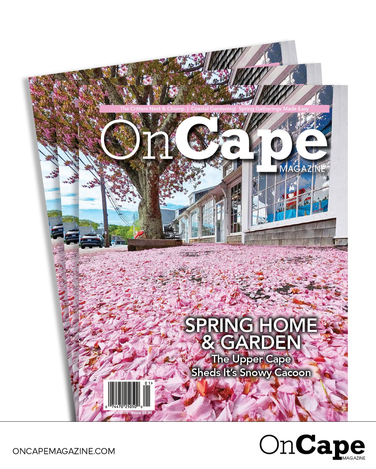
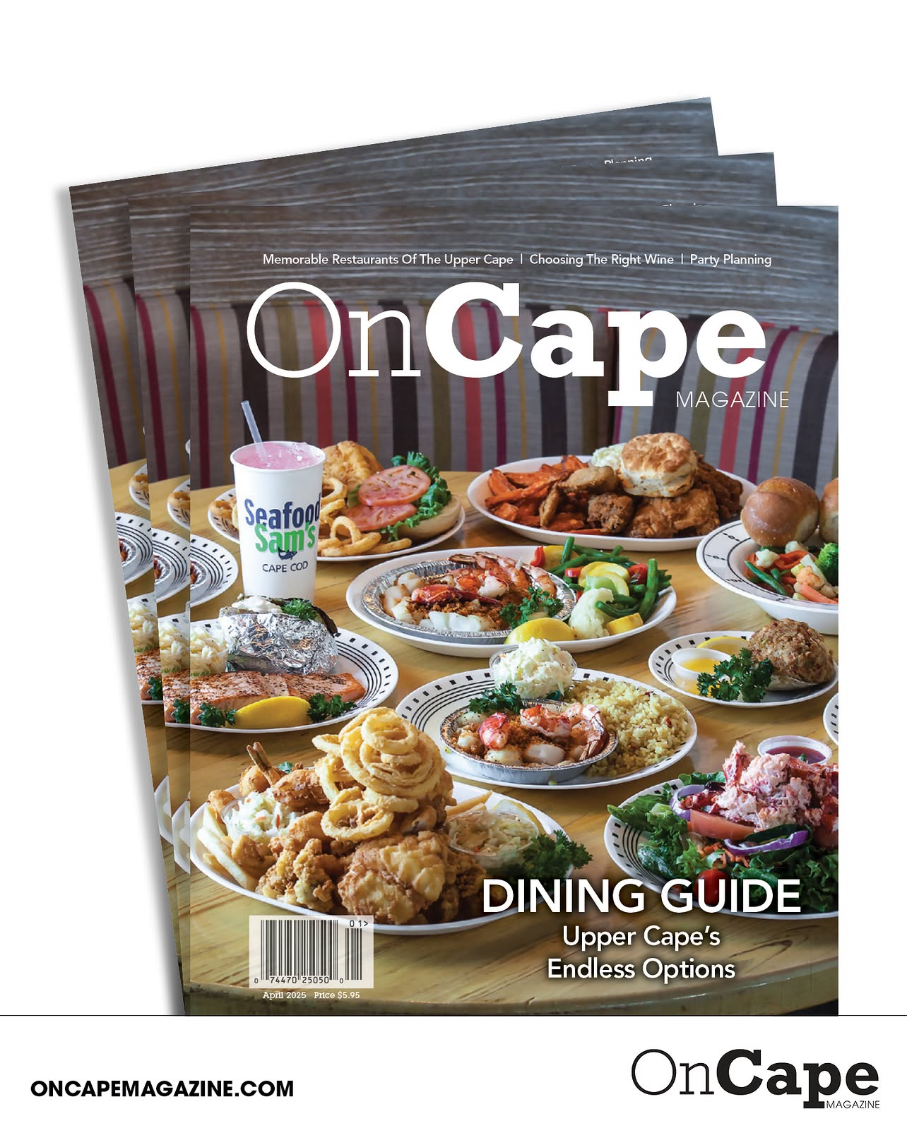
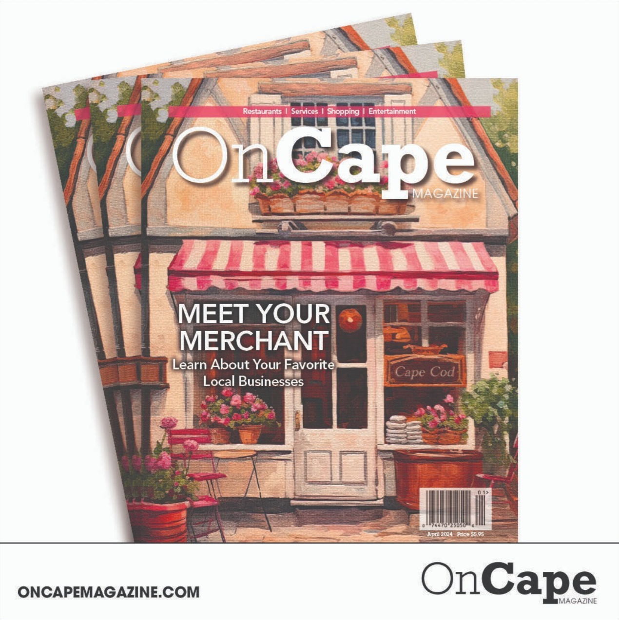
New Issue Template
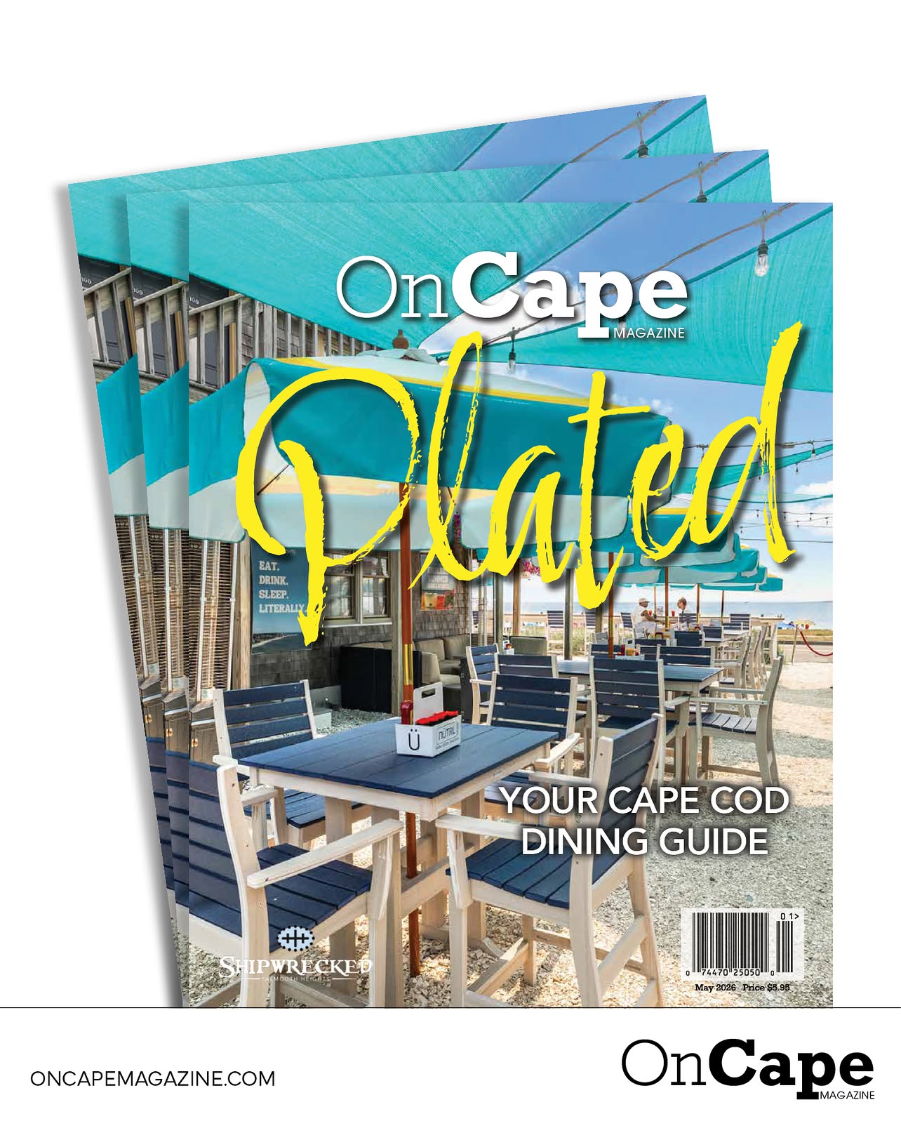
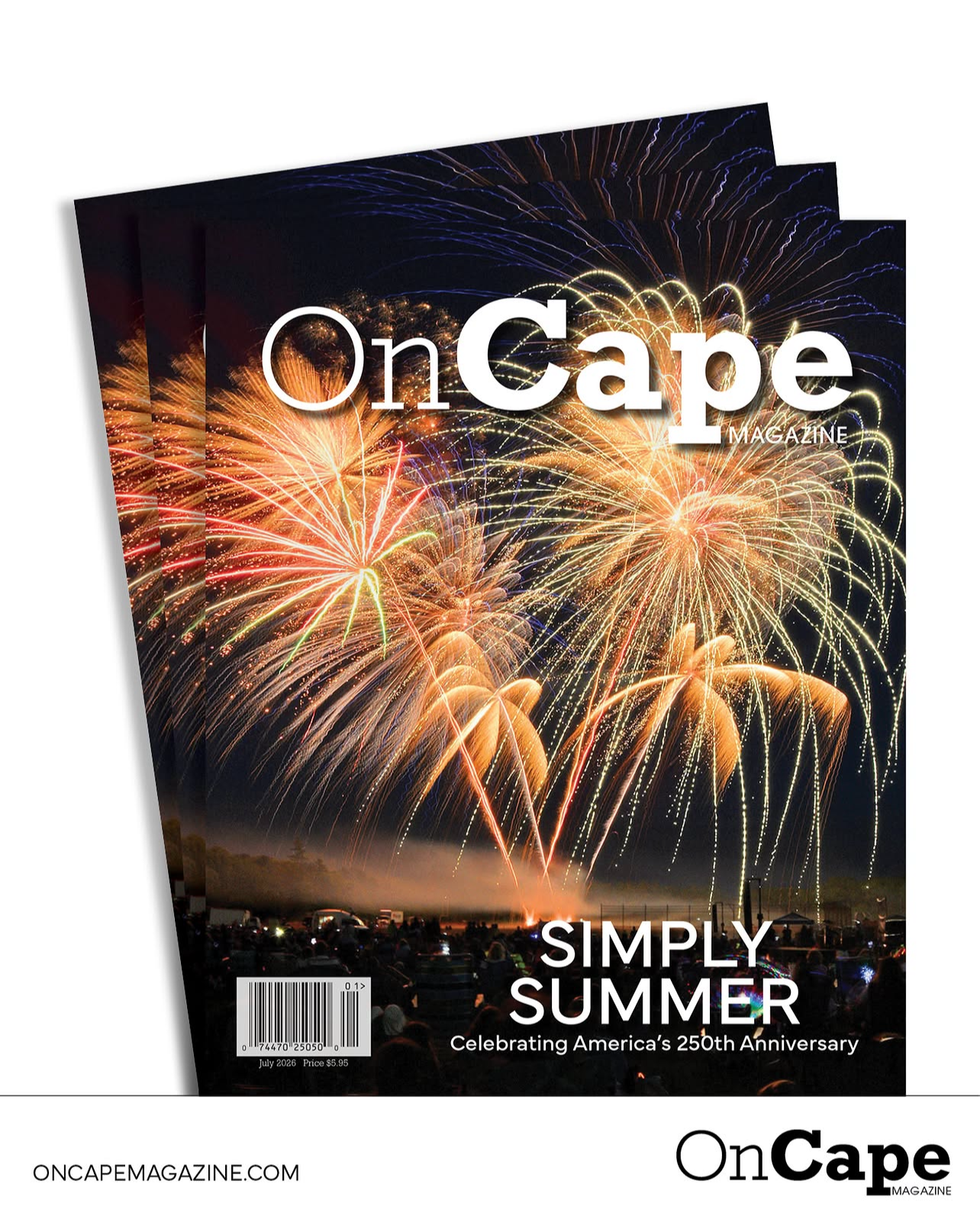
I created this template to showcase the latest editions of OnCape Magazine and build consistency across our social media platforms. Every Friday a new issue was published, I shared the post to remind readers to check their weekly Enterprise newspaper and discover the newest edition of OnCape.
The goal was to create a recognizable, cohesive look that strengthened brand awareness while directing followers to our website to read the latest issue. The clean, polished design provided an easy and engaging way to keep our audience informed and highlight each new publication.
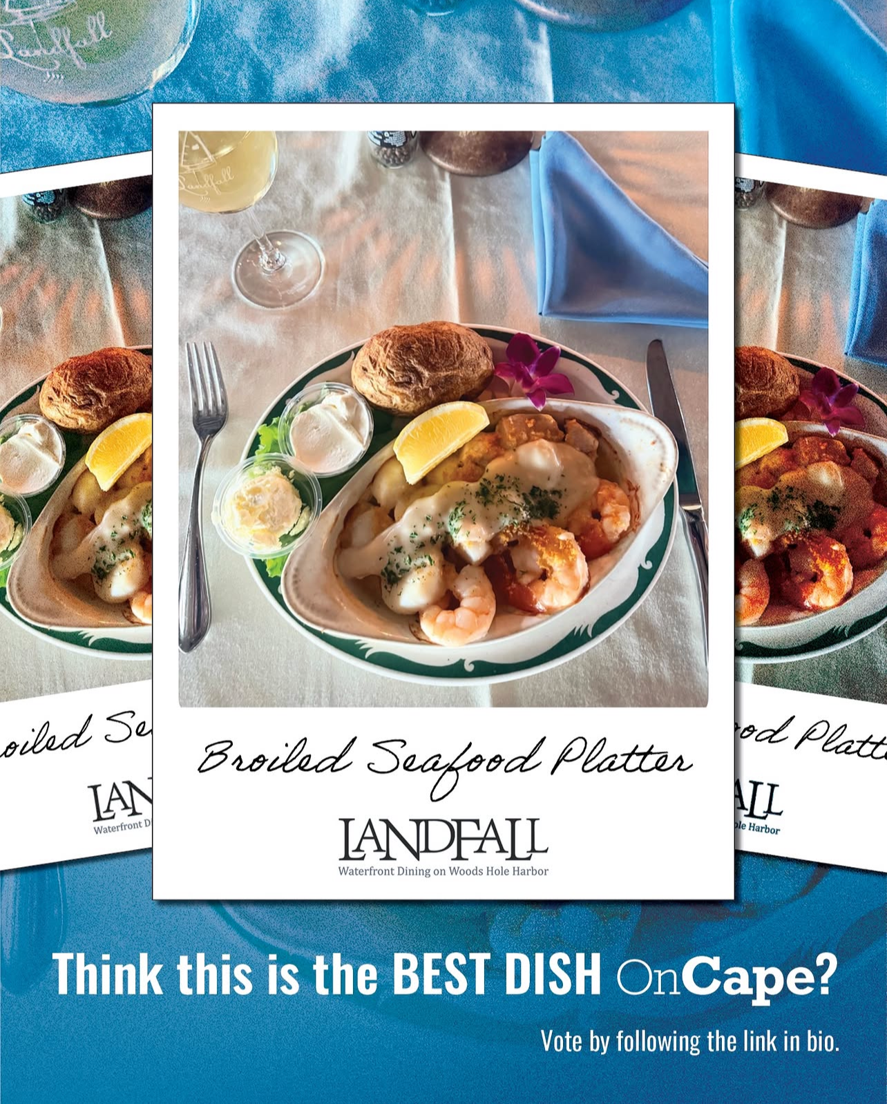
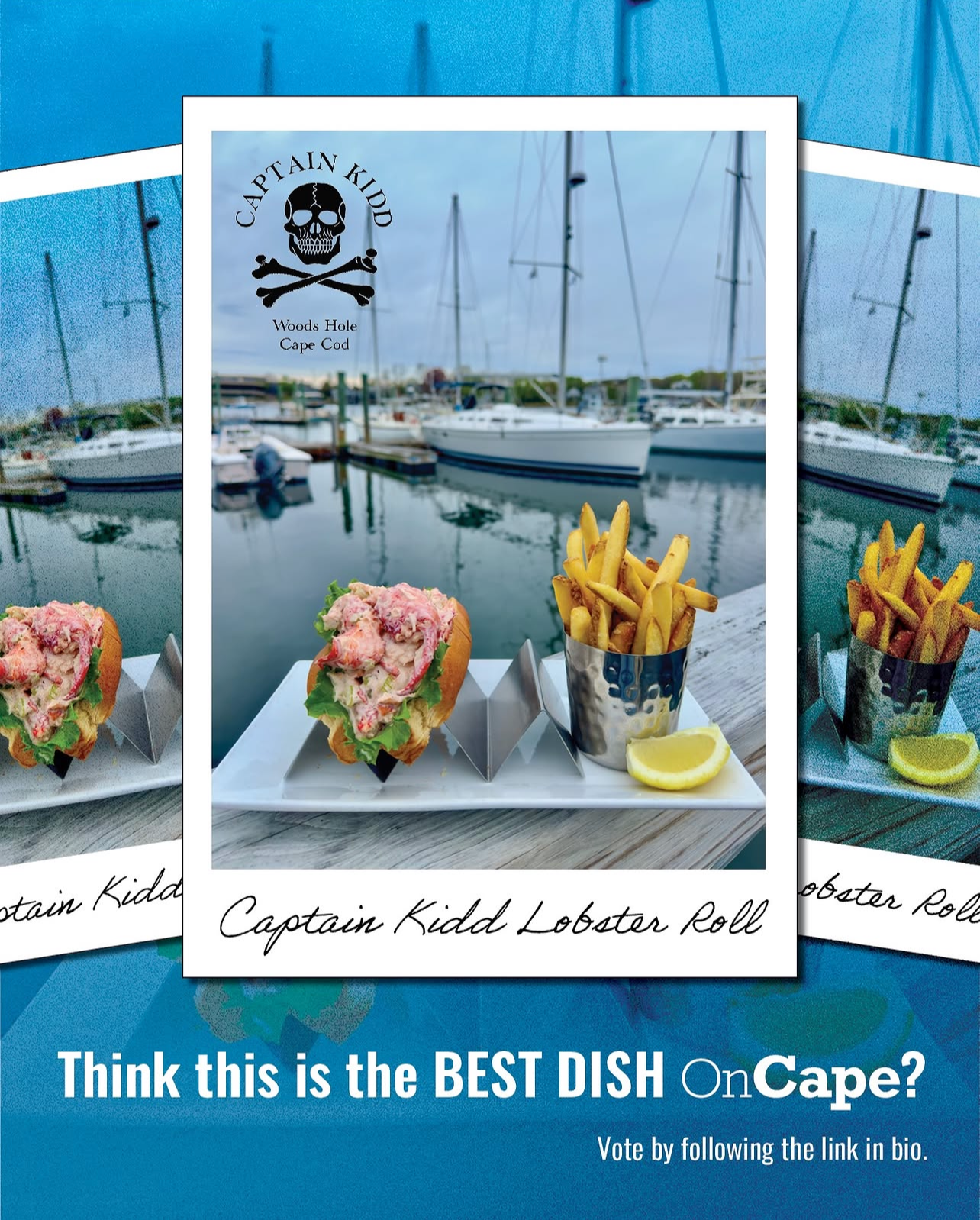
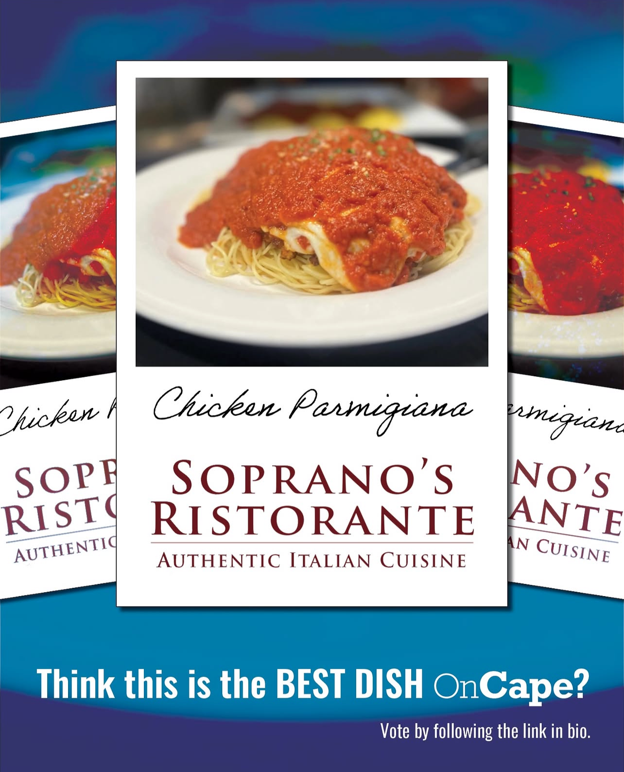
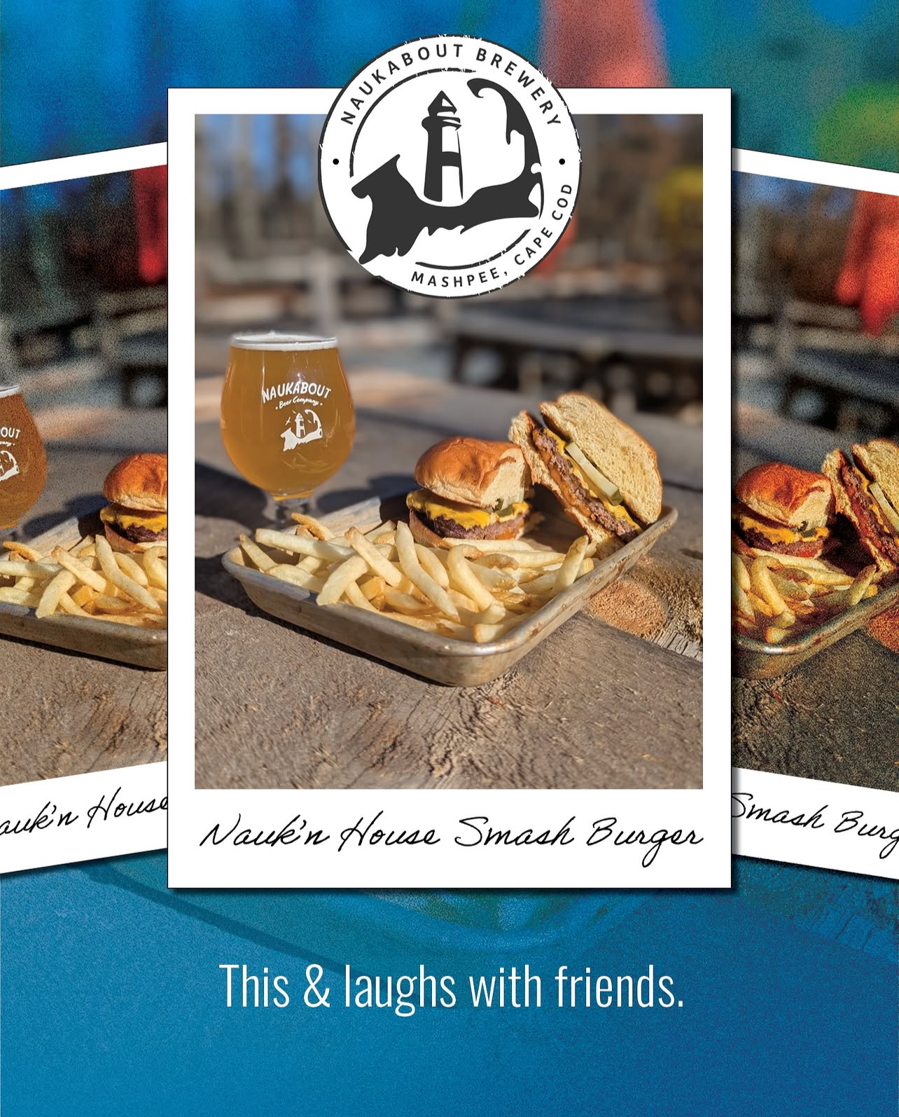
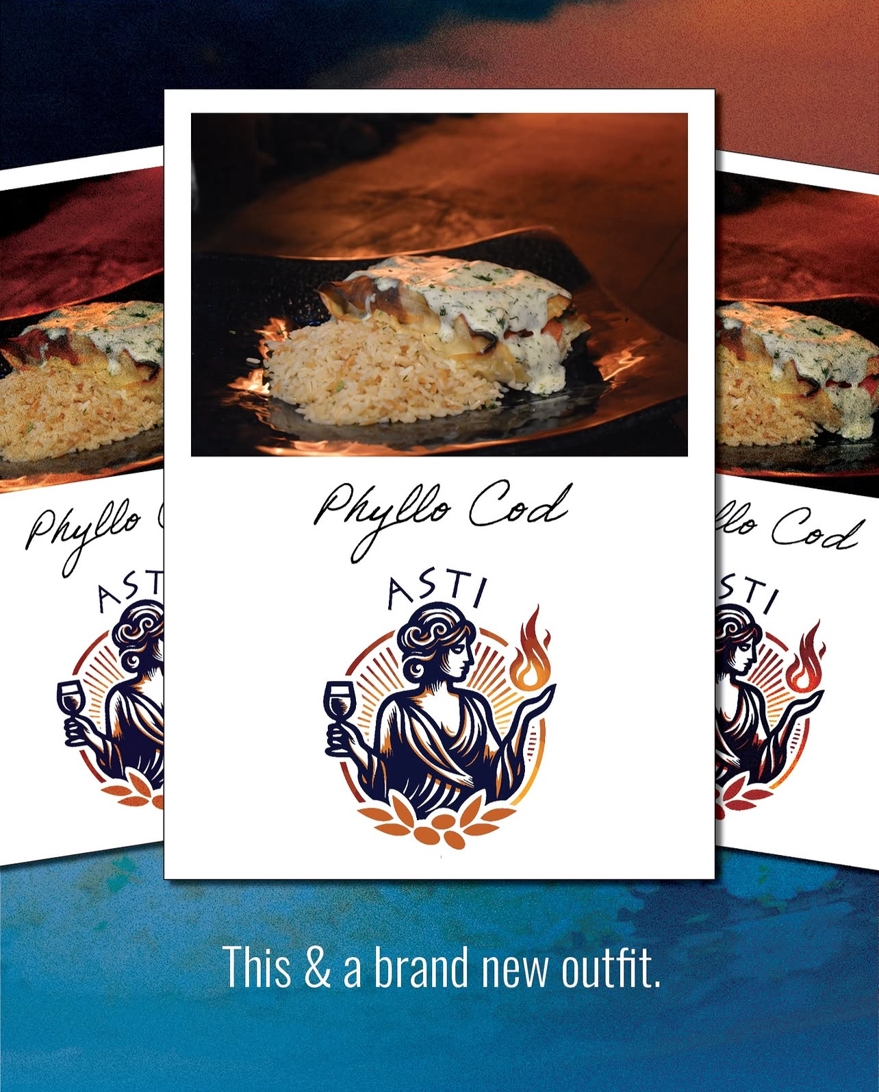
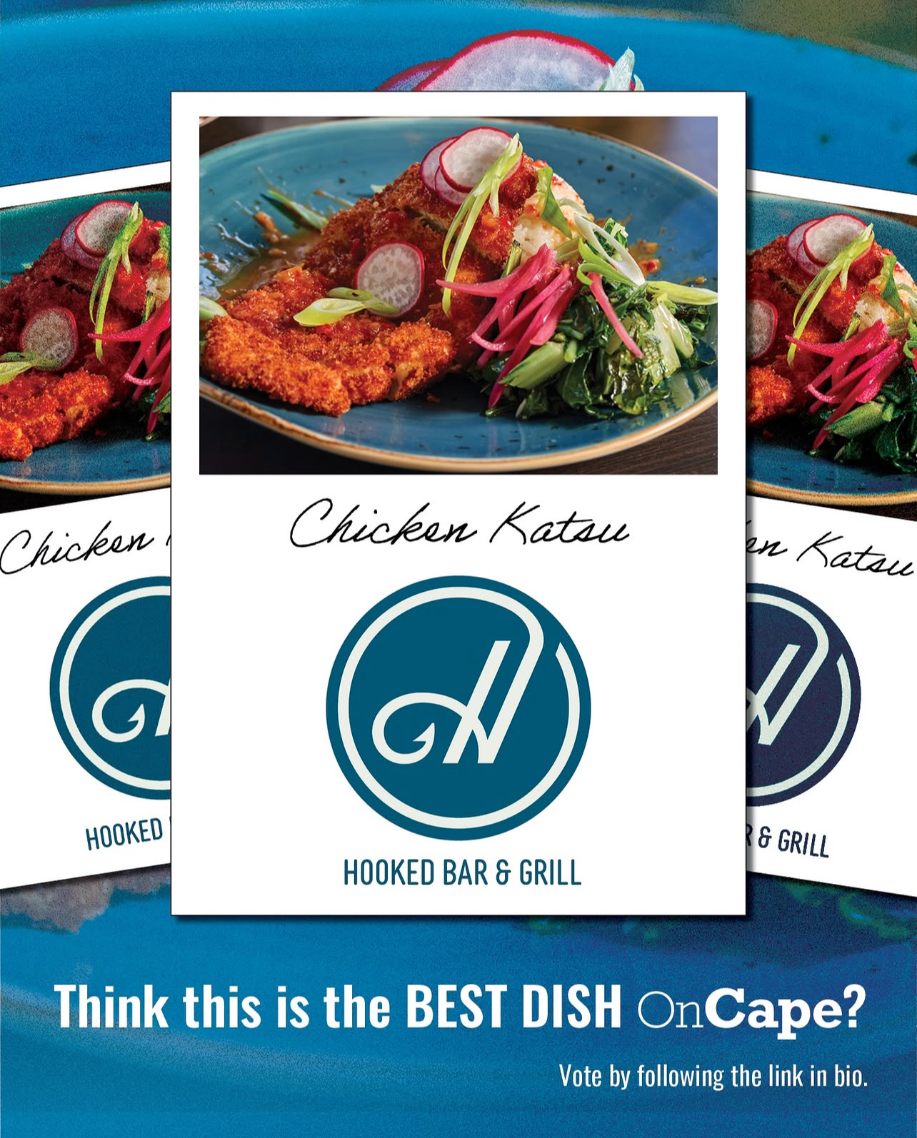
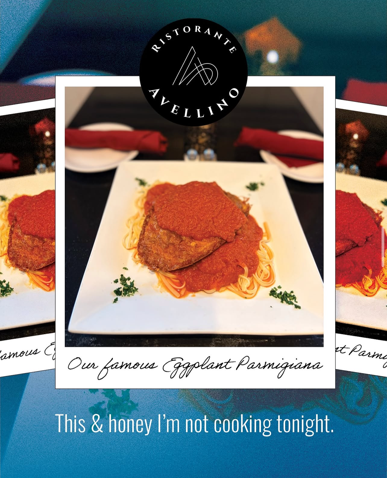
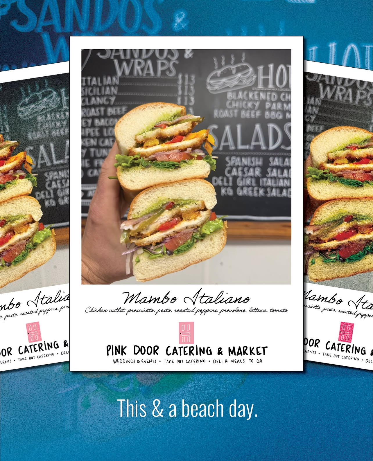
Participating restaurants submitted photos of their signature dishes, and the Cape Cod community voted for their favorites. As the competition neared its end, we wanted to find a fresh way to increase engagement and encourage more people to vote.
I created a social media post using the trending “This &…” caption format to capture attention and keep viewers engaged a little longer. Rather than relying on another traditional promotional post asking people to stop scrolling and vote, I leaned into a format that felt natural to the platform and entertaining to the audience. The approach helped generate more views and participation as the competition wrapped up.
For the visual direction, I chose a Polaroid-inspired layout to bring consistency to the submissions. Because the photo guidelines were flexible, we received images in a variety of sizes and quality levels. The Polaroid treatment helped unify the different photos while giving the campaign a playful, cohesive feel. I finished the design with a classic blue-and-white palette, a familiar Cape Cod combination that connected the campaign to the community and its coastal identity.
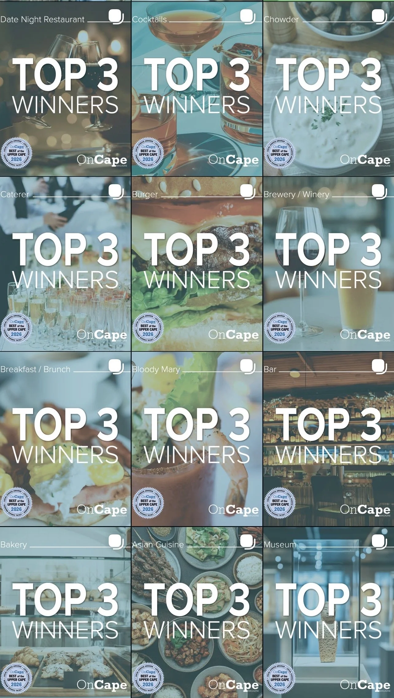
BOUC Top 3 Winners
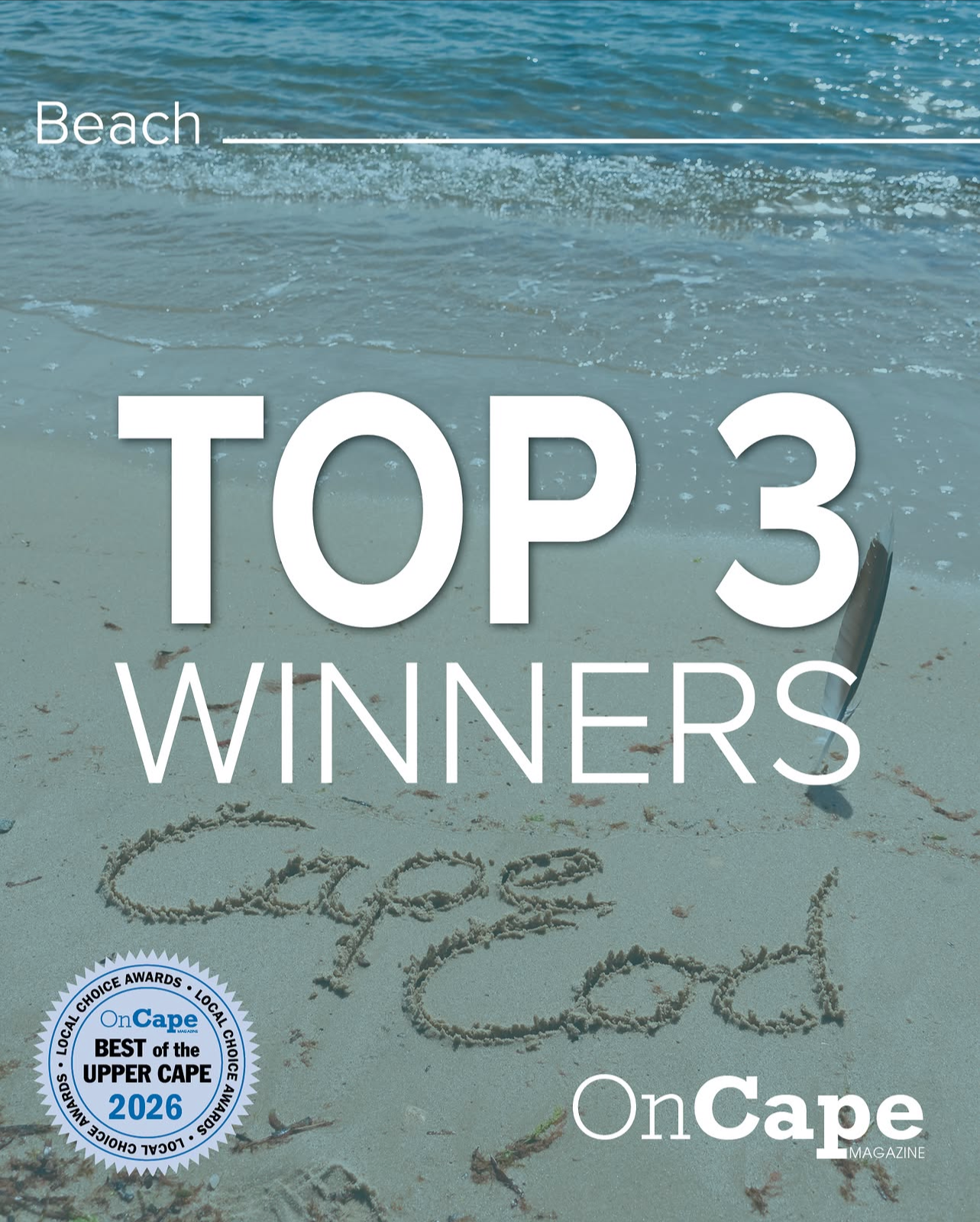
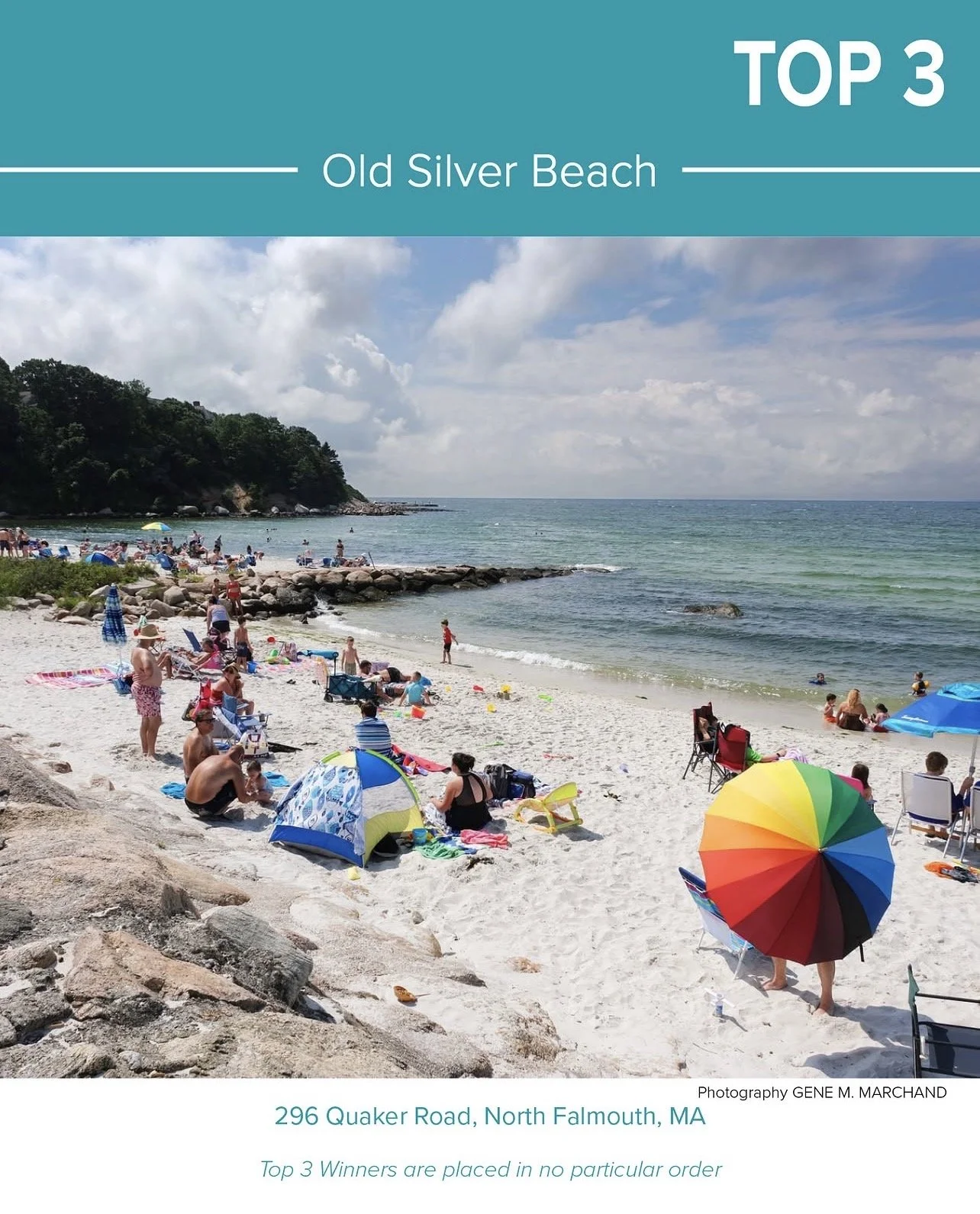
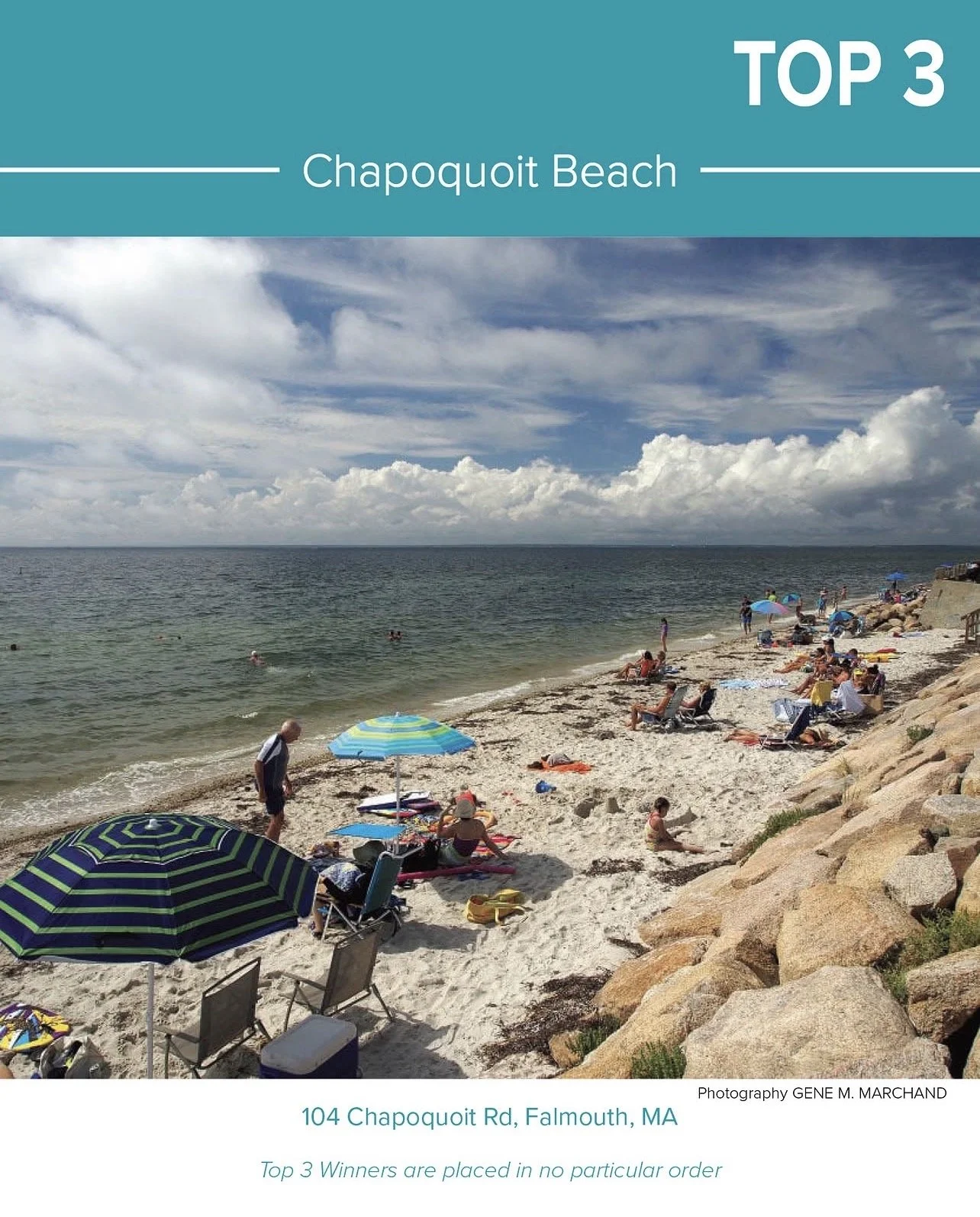
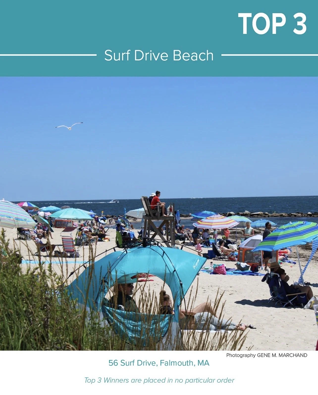
The most time-intensive yet rewarding part of managing social media was creating the Top 3 Winner announcements for our Best of the Upper Cape (BOUC) competition. This process required weeks of preparation, careful organization, and consistent communication to ensure every business name, logo, and detail was accurate.
For the design, I built on the established BOUC logo and visual identity to maintain brand consistency across the winner announcements. I developed a flexible layout that could accommodate each business’s unique logo and information while keeping the overall presentation cohesive, recognizable, and celebratory.
Onion Ring-Off
Best of the Upper Cape Local Choice Awards 2025-2026
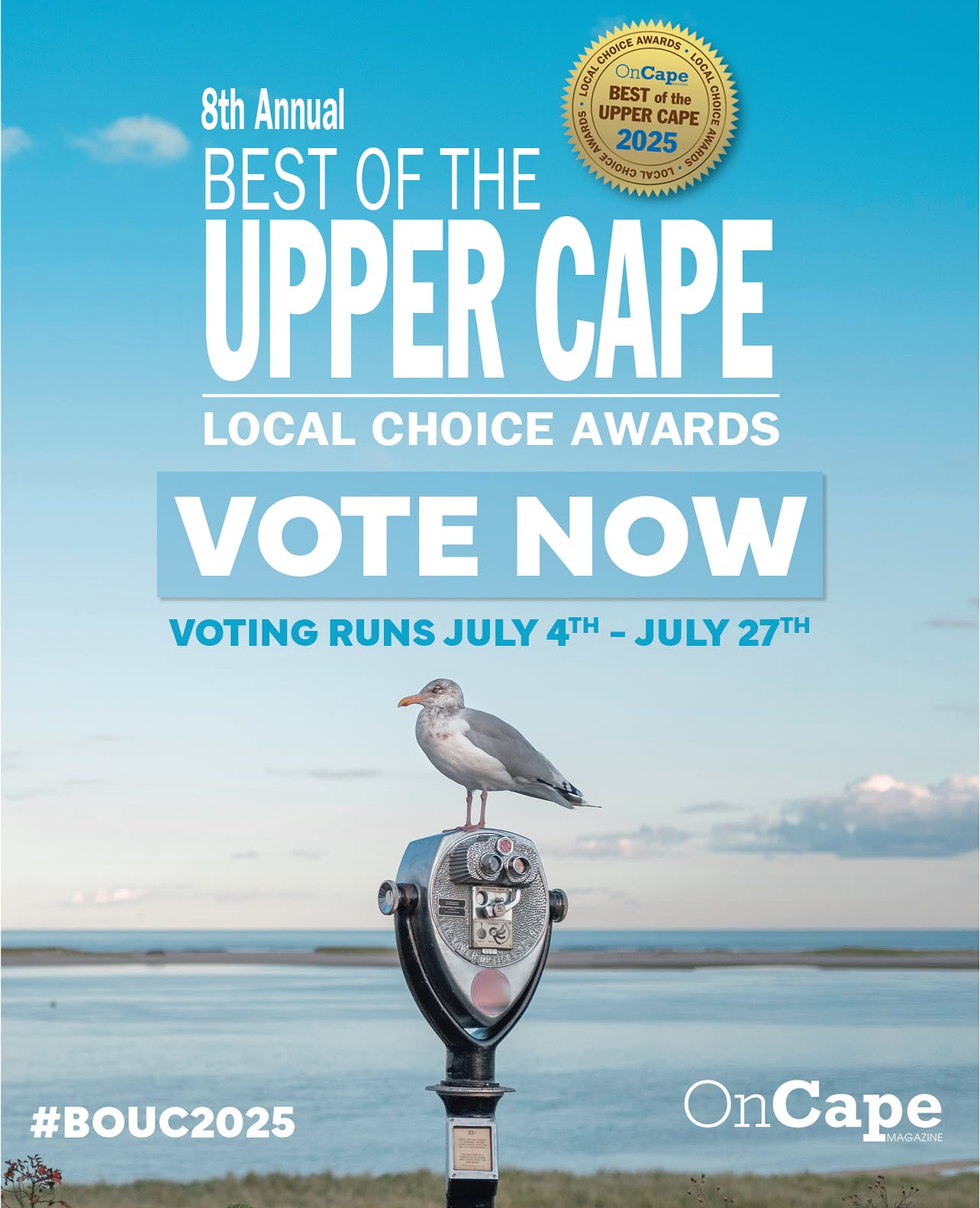
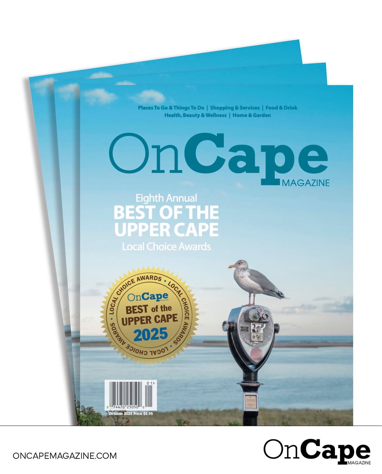
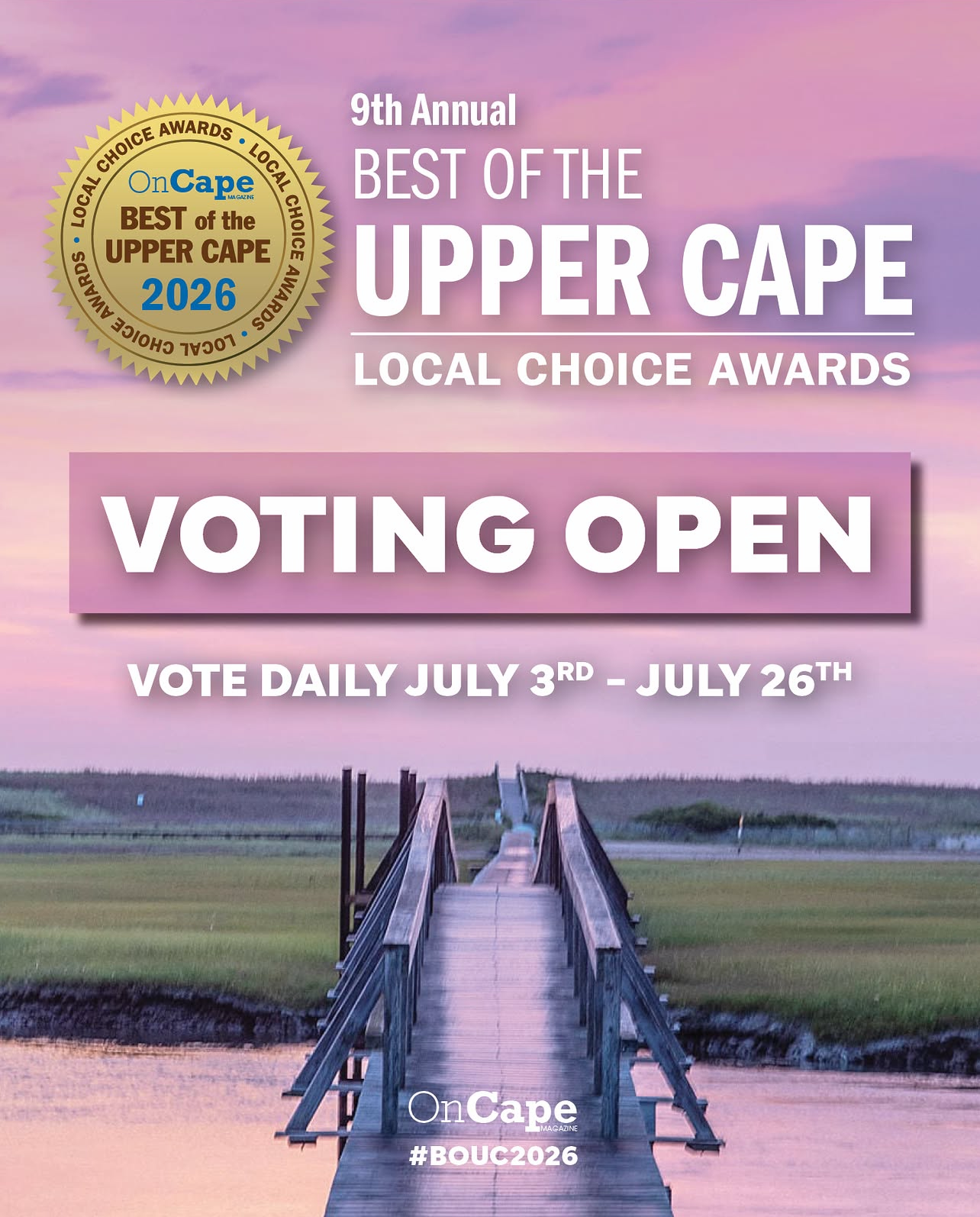
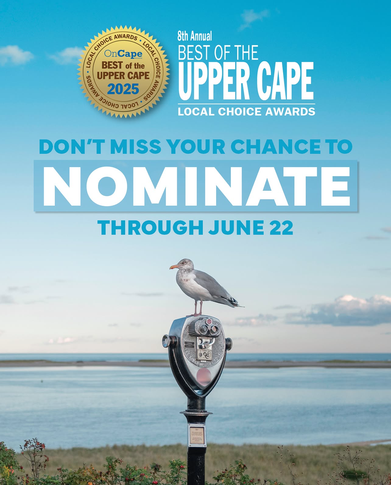
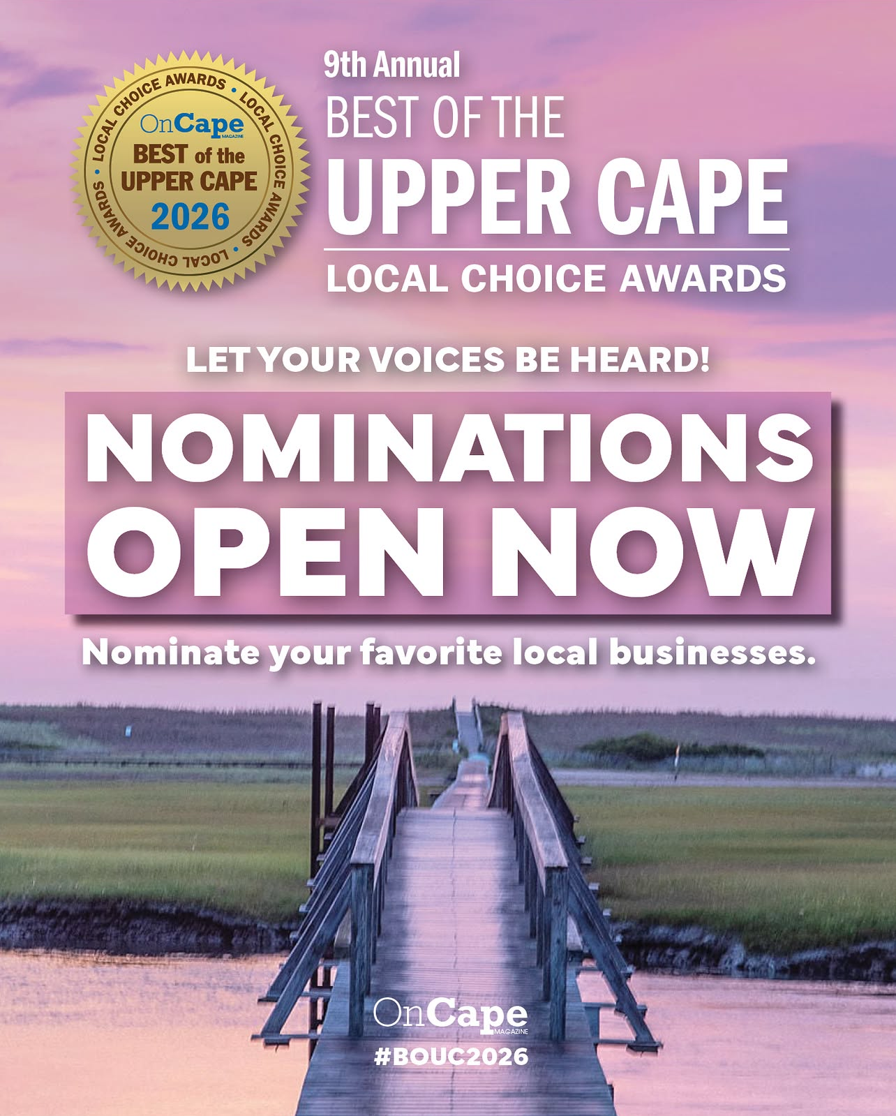
One of the most valuable contributions I brought to OnCape Magazine was creating a consistent visual identity for one of our most recognizable brands, Best of the Upper Cape’s Local Choice Awards (BOUC). The branding extended far beyond social media, encompassing the magazine, awards, PowerPoint presentations, event materials, and merch. My goal was to create a cohesive look that audiences could recognize across every platform and touchpoint.
I began by choosing imagery that captured the nostalgia and character of Cape Cod. For the first campaign, I selected a seagull perched on a pair of binoculars. As a Cape Cod native, the image reminded me of taking the Steamship Authority ferry to Martha’s Vineyard and looking through binoculars at the passing coastline. It was a simple but meaningful visual that connected to the experiences and memories shared by many who live on or visit the Cape.
The following year, I chose the Sandwich Boardwalk as the central image. There is something nostalgic about an empty boardwalk at the end of summer, capturing the quiet transition between the busy tourist season and the changing months ahead. It was a fitting visual for BOUC, as the competition begins to build momentum during this time of year.
By drawing inspiration from familiar local landmarks and experiences, I helped develop a visual identity that felt authentic to the Cape Cod community while maintaining consistency across the BOUC brand.